HTML 5.1 日本語訳
HTMLとXHTMLのための語彙と関連API
Editor's Draft 2 October 2014
HTMLとXHTMLのための語彙と関連API
Editor's Draft 2 October 2014
details要素summary要素に続くフローコンテンツ。open - detailsが可視かどうかaria-expandedをサポートする任意のrolearia-*属性。interface HTMLDetailsElement : HTMLElement {
attribute boolean open;
};
details要素は、ユーザーが追加情報やコントロールを得ることができるディスクロージャーウィジェットを表す。
details要素は、脚注には適さない。脚注をマークアップする方法の詳細については、脚注のセクションを参照のこと。
The first summary element child of the element, if any,
represents the summary or legend of the details. If there is no
child summary element, the user agent should provide its own legend (e.g.
"Details").
要素のコンテンツの残り部分は、追加情報やコントロールを表す。
openコンテンツ属性は、真偽属性である。存在する場合、この属性は要約と追加情報の両方がユーザーに表示されることを示す。属性が存在しない場合、要約のみが表示されるようになる。
When the element is created, if the attribute is absent, the additional information should be hidden; if the attribute is present, that information should be shown. Subsequently, if the attribute is removed, then the information should be hidden; if the attribute is added, the information should be shown.
The user agent should allow the user to request that the additional information be shown or
hidden. To honor a request for the details to be shown, the user agent must set the open attribute on the element to the value open. To honor a request for the information to be hidden, the user agent must
remove the open attribute from the element.
Whenever the open attribute is added to or removed from
a details element, the user agent must queue a task that runs the
following steps, which are known as the details notification task steps, for this
details element:
If another task has been queued to run the details notification task steps for this
details element, then abort these steps.
When the open attribute is toggled
several times in succession, these steps essentially get coalesced so that only one event is
fired.
Fire a simple event named toggle at the
details element.
The task source for this task must be the DOM manipulation task source.
The open IDL attribute must
reflect the open content attribute.
次の例は、details要素が進捗報告書で技術的な詳細を非表示にするために使用される様子を示す。
<section class="progress window">
 <h1>Copying "Really Achieving Your Childhood Dreams"</h1>
 <details>
  <summary>Copying... <progress max="375505392" value="97543282"></progress> 25%</summary>
  <dl>
   <dt>Transfer rate:</dt> <dd>452KB/s</dd>
   <dt>Local filename:</dt> <dd>/home/rpausch/raycd.m4v</dd>
   <dt>Remote filename:</dt> <dd>/var/www/lectures/raycd.m4v</dd>
   <dt>Duration:</dt> <dd>01:16:27</dd>
   <dt>Color profile:</dt> <dd>SD (6-1-6)</dd>
   <dt>Dimensions:</dt> <dd>320×240</dd>
  </dl>
 </details>
</section>
以下は、details要素がデフォルトで一部のコントロールを非表示にするために使用できる様子を示す:
<details>
 <summary><label for=fn>Name & Extension:</label></summary>
 <p><input type=text id=fn name=fn value="Pillar Magazine.pdf">
 <p><label><input type=checkbox name=ext checked> Hide extension</label>
</details>
これは、ユーザーがそれぞれを開くことができる機能とともに、見出しの小さなセットにフィールドのセットを折りたたむことができるよう、リスト内の他のdetailsとともにこれを使用できる。
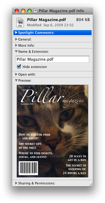
これらの例において、要約はコントロールが変更できるものをまとめたものであり、理想に満たない実際値ではない。
ユーザーがコントロールを操作するために自動的にopen属性が追加および削除されるので、この属性の状態に基づく異なる、この属性CSSで要素に使用できる。これは、スタイルシートが要素を開いたり閉じたりする際に、要約の色をアニメーション化するために使用される:
<style>
 details > summary { transition: color 1s; color: black; }
 details[open] > summary { color: red; }
</style>
<details>
 <summary>Automated Status: Operational</summary>
 <p>Velocity: 12m/s</p>
 <p>Direction: North</p>
</details>
summary要素details要素の最初の子として。button.aria-*属性。HTMLElementを使用する。The summary element represents a summary, caption, or legend for the
rest of the contents of the summary element's parent details
element, if any.
menu要素type属性がtoolbar状態である場合:パルパブルコンテンツ。type属性がポップアップメニュー状態にある場合:type属性がポップアップメニュー状態にあるmenu要素の子として。type属性がtoolbar状態にある場合:0個以上のliおよびスクリプトサポート要素またはフローコンテンツのいずれか。type属性がポップアップメニュー状態にある場合:任意の順序で、0個以上のmenuitem要素、0個以上のhr要素、type属性がポップアップメニュー状態にある0個以上のmenu要素、および0個以上のスクリプトサポート要素。type - メニューの種類label - ユーザー可視ラベルmenu(デフォルト - 設定しない)、directory、list、listbox、menubar、tablist、tabpanelまたはtree。aria-*属性。interface HTMLMenuElement : HTMLElement {
attribute DOMString type;
attribute DOMString label;
};
menu要素は、コマンドのリストを表す。
type属性は、宣言されているメニューの種類を示す列挙属性である。この属性は2つの状態を持つ。popupキーワードは、要素がコンテキストメニューまたはメニューボタンのためのメニューを宣言する、ポップアップメニュー状態に対応する。toolbarキーワードは、要素がツールバーを宣言する、ツールバー状態に対応する。属性は省略されてもよい。親要素がtype属性がポップアップメニュー状態にあるmenu要素である場合、欠損値のデフォルトはポップアップメニュー状態であり、そうでなければ、ツールバー状態である。
menu要素のtype属性がポップアップメニュー状態にある場合、要素はポップアップメニューのコマンドを表し、そのポップアップメニューが他の要素によって活性化される場合、ユーザーはcontextmenu属性またはbutton要素のmenu属性のいずれかを介して、調査してかつコマンドと対話することができる。
menu要素のtype属性がツールバー状態にある場合、要素は、ユーザーが実行またはアクティブ化可能なコマンドをそれぞれ表す、項目の順不同リスト(li要素によって表される)または、要素がli要素の子を持たない場合、利用可能なコマンドを記述するフローコンテンツのいずれかの形で、そのコンテンツで構成されるツールバーを表す。
label属性はメニューのラベルを与える。これは、入れ子のメニューを表示するユーザーエージェントによって使用される:別のメニューを含むコンテキストメニューは、サブメニューのメニューラベルのためにネストされたメニューのlabel属性を使用する。label属性は、type属性がポップアップメニュー状態にあるmenu要素である親要素となるmenu要素で指定しなければならない。
A menu is a currently relevant menu element if it is the
child of a currently relevant menu element, or if it is the
designated pop-up menu of a button element that is not
inert, does not have a hidden attribute, and is not
the descendant of an element with a hidden attribute.
A pop-up menu consists of a list of zero or more menu items, which can be any of:
menuitem)hr)menu)To construct and show a menu for a particular menu element and with a
particular element as a subject, the user agent must run the following steps:
Let the menu be an empty list of the type described above.
Run the menu builder steps for the menu element using the menu
prepared in the previous list as the output.
The menu builder steps for a menu element using a specific menu as
output are as follows: For each child node of the menu in tree order,
run the appropriate steps from the following list:
menuitem element that defines
a commandmenuitem element has a default attribute, mark the command as being a default command.hr elementmenu element with no label attributemenu element for the same menu, then append another separator to the
menu.menu element with a label attributemenu element using the
new submenu as the output. Then, append the submenu to the menu, using the value of the child
menu element's label attribute as the label
of the submenu.Remove any submenu with no label, or whose label is the empty string, in the menu or any submenus.
Remove any menu item with no label, or whose label is the empty string, in the menu or any submenus.
Collapse all sequences of two or more adjacent separators in the menu or any submenus to a single separator.
Remove all separators at the start or end of the menu and any submenus.
Display the menu to the user, and let the algorithm that invoked this one continue.
If the user selects a menu item that corresponds to an element that still represents a command when the user selects it, then the UA must invoke that
command's Action. If the command's Action is defined as firing
a click event, either directly or via the run
synthetic click activation steps algorithm, then the relatedTarget attribute of that click event must be initialised to the subject passed to this
construct and show a menu algorithm.
Pop-up menus must not, while being shown, reflect changes in the DOM. The menu is constructed from the DOM before being shown, and is then immutable.
typeIDL属性は、既知の値に制限され、同じ名前のコンテンツ属性を反映しなければならない。
The label IDL attribute must
reflect the content attribute of the same name.
この例において、menu要素は、一連のオプションをともなうドロップダウンメニューをもつ各々が、その上に3つのメニューボタンとツールバーを記述するために使用される:
<menu>
 <li>
  <button type=menu value="File" menu="filemenu">
  <menu id="filemenu" type="popup">
   <menuitem onclick="fnew()" label="New...">
   <menuitem onclick="fopen()" label="Open...">
   <menuitem onclick="fsave()" label="Save">
   <menuitem onclick="fsaveas()" label="Save as...">
  </menu>
 </li>
 <li>
  <button type=menu value="Edit" menu="editmenu">
  <menu id="editmenu" type="popup">
   <menuitem onclick="ecopy()" label="Copy">
   <menuitem onclick="ecut()" label="Cut">
   <menuitem onclick="epaste()" label="Paste">
  </menu>
 </li>
 <li>
  <button type=menu value="Help" menu="helpmenu">
  <menu id="helpmenu" type="popup">
   <menuitem onclick="location='help.html'" label="Help">
   <menuitem onclick="location='about.html'" label="About">
  </menu>
 </li>
</menu>
サポートするユーザエージェントにおいて、これは(ユーザーが単に2番目のボタンをアクティブにしていると仮定して)次のようになるだろう:

menuitem要素type属性がポップアップメニュー状態であるmenu要素の子として。type - コマンドの種類label - ユーザー可視ラベルicon - コマンドに対するアイコンdisabled - コマンドまたはコントロールがチェックされているかどうかchecked - コマンドまたはコントロールがチェックされているかどうかradiogroup ラジオボタングループとして処理するコマンドクループ名default - デフォルトコマンドであるとしてコマンドをマークするcommand - コマンド定義title属性は特別なセマンティックを持つ。menuitem (デフォルト - 設定しない)。aria-*属性。interface HTMLMenuItemElement : HTMLElement {
attribute DOMString type;
attribute DOMString label;
attribute DOMString icon;
attribute boolean disabled;
attribute boolean checked;
attribute DOMString radiogroup;
attribute boolean default;
readonly attribute HTMLElement? command;
};
menuitem要素は、ユーザーがポップアップメニュー(コンテキストメニューまたはメニューボタンのメニューのいずれか)から呼び出すことができるコマンドを表す。
1つ以上のtype、label、icon、disabled、checked、radiogroup属性を使用するmenuitem要素は、新しいコマンドを定義する。
command属性を使用するmenuitem要素は、他の要素を参照してコマンドを定義する。これは、著者に一度にコマンドの定義し、1つの場所でその状態(たとえば、アクティブかまたは無効か)を設定し、同時にユーザーインターフェースでそのコマンドへのすべての参照を持つことができる。
command属性を指定する場合、要素は間接コマンドモードである。この要素が指定されない場合、明示コマンドモードである。要素が間接コマンドモードにある場合、この要素は指定された次のいずれかの属性を持たなければならない:type、label、icon、disabled、checked、radiogroup。
type属性は、関連付けられたアクションを持つ通常のコマンド、または切り替え可能な状態やオプション、または項目リストから1項目の選択のいずれかとしてコマンドの種類を示す。
属性は、次の3つのキーワードと状態を持つ列挙属性である。"command"キーワードはCommand状態に対応し、"checkbox"キーワードはCheckbox状態に対応し、"radio"キーワードはRadio状態に対応する。欠損値のデフォルトは、コマンド状態である。
要素は、関連付けられたアクションを持つ通常のコマンドを表す。
要素は、切り替え可能な状態やオプションを表す。
要素は、項目リストから1項目の選択を表す。
ユーザーに示されるように、label属性はコマンドの名前を与える。要素が明示コマンドモードである場合、label属性が指定されなければならない。属性が指定される場合、属性は空文字列でない値を持たなければならない。
icon属性は、コマンドを表す画像を提供する。属性が指定される場合、属性値は潜在的にスペースで囲まれた妥当な空でないURLを含めなければならない。To obtain the absolute URL of the icon when the attribute's value is not the empty string, the attribute's value must be resolved relative to the element. When the attribute is absent, or its value is the empty string, or resolving its value fails, there is no icon.
disabled属性が存在する場合、コマンドが現在の状態で利用できないことを示す真偽属性である。
disabledとhiddenとの違いはごくわずかである。同じ文脈で状況の特定の側面を変更した場合にも、属性が有効になっている可能性がある場合、コマンドは無効になる。そのような状況で、コマンドが有効にされることはない場合、コマンドはhiddenとマークされる。たとえば蛇口のコンテキストメニューで蛇口が既に開いている場合、コマンド"開ける"は無効であるかもしれないが、コマンド"食べる"は蛇口を食べることはできないので、hiddenとマークされる。
checked属性が存在する場合、コマンドが選択されていることを示す真偽属性である。type属性がチェックボックス状態またはラジオ状態どちらかのである場合を除き、属性は省略しなければならない。
radiogroup属性は、type属性が値"radio"を持つコマンドの場合、コマンド自体が切り替えられる際に、切り替えられたコマンドのグループ名を与える。名前の範囲は親要素の子のリストである。type属性がラジオ状態である場合を除き、属性は省略しなければならない。指定される場合、属性値は空でない文字列でなければならない。
menuitem要素のslaveがcommand属性を持ち、IDがslaveのcommand属性の値と同じ値であるslaveのホームサブツリーが存在し、かつツリー順で最初のそのような要素、以下master、自身がコマンドを定義し、それ自体がmenuitem要素でないか、command属性をもつ自身でないいずれかの場合、slaveのマスターコマンドは、masterである。
command属性をもつmenuitem要素は、マスターコマンドを持たなければならない。
これは事実上のコマンドを定義する別の要素のIDであるとして属性値の構文を定義する。
title属性は、ユーザーを助けるために表示されるだろうコマンドを記述するヒントを与える。
default属性が存在する場合、コマンドは、ユーザーがメニューを使用する代わりにメニューの件名を直接アクティブにするかどうかに呼び出されていたものであることを示す。default属性は真偽属性である。
この簡単な例において、送信ボタンは、1つはフォームをリセットするための、もう1つはフォームを送信するための、2つのオプションを持つコンテキストメニューを与えられている。送信コマンドは、デフォルトとしてマークされる。
<form action="dosearch.pl">
 <p><label>Enter search terms: <input type="text" name="terms"></label></p>
 <p><input type=submit contextmenu=formmenu id="submitbutton"></p>
 <p hidden><input type=reset id="resetbutton"></p>
 <menu type=popup id=formmenu>
  <menuitem command="submitbutton" default>
  <menuitem command="resetbutton">
 </menu>
</form>
typeIDL属性は、既知の値に制限され、同じ名前のコンテンツ属性を反映しなければならない。
The label, icon, disabled, checked, and radiogroup, and default IDL attributes must reflect
the respective content attributes of the same name.
The command IDL attribute must return the
master command, if any, or null otherwise.
If the element's Disabled State is false
(enabled) then the element's activation behavior depends on the element's type and command
attributes, as follows:
command attributeThe user agent must run synthetic click activation steps on the element's master command.
type attribute is in the Checkbox stateIf the element has a checked attribute, the UA
must remove that attribute. Otherwise, the UA must add a checked attribute, with the literal value checked.
type attribute is in the Radio stateIf the element has a parent, then the UA must walk the list of child nodes of that parent
element, and for each node that is a menuitem element, if that element has a radiogroup attribute whose value exactly matches the
current element's (treating missing radiogroup
attributes as if they were the empty string), and has a checked attribute, must remove that attribute.
Then, the element's checked attribute must be set
to the literal value checked.
The element's activation behavior is to do nothing.
Firing a synthetic click event at the element
does not cause any of the actions described above to happen.
If the element's Disabled State is true (disabled) then the element has no activation behavior.
menuitem要素は、ポップアップメニューの一部を除いて表示されない。
ここでは左、中央、右の間に、ユーザーが切り替えできる3つのオプションを備えたポップアップメニューボタンの例である。1つは、テキストエディタの一部のようなツールバーを想像できるかもしれない。メニューはまた、そのメニュー項目が無効になっているにもかかわらず、"Publish"というラベルの付いた別のメニュー項目に続いてセパレータを持つ。
<button type=menu menu=editmenu>Commands...</button>
<menu type="popup" id="editmenu">
 <menuitem type="radio" radiogroup="alignment" checked="checked"
          label="Left" icon="icons/alL.png" onclick="setAlign('left')">
 <menuitem type="radio" radiogroup="alignment"
          label="Center" icon="icons/alC.png" onclick="setAlign('center')">
 <menuitem type="radio" radiogroup="alignment"
          label="Right" icon="icons/alR.png" onclick="setAlign('right')">
 <hr>
 <menuitem type="command" disabled
          label="Publish" icon="icons/pub.png" onclick="publish()">
</menu>
contextmenu属性は、要素のコンテキストメニューを与える。値は、type属性がポップアップメニュー状態にある同じホームサブツリーでmenu要素のIDでなければならない。
(たとえば、要求を行うためのポインティングデバイスやキーボードキーを使用して)ユーザーが要素のコンテキストメニューを要求し、要素がcontextmenu属性を持つ場合、 ユーザーエージェントがその要素でcontextmenuイベントを最初に発火し、そのイベントがキャンセルされない場合、menu要素でshowイベントを発火する。
ここで、入力コントロールのコンテキストメニューの例は次のとおり:
<form name="npc">
 <label>Character name: <input name=char type=text contextmenu=namemenu required></label>
 <menu type=popup id=namemenu>
  <menuitem label="Pick random name" onclick="document.forms.npc.elements.char.value = getRandomName()">
  <menuitem label="Prefill other fields based on name" onclick="prefillFields(document.forms.npc.elements.char.value)">
 </menu>
</form>
これは、コントロールのコンテキストメニューに2つの項目を追加し、1つは"Pick random name"と呼ばれ、1つは"Prefill other fields based on name"と呼ばれる。これらは、上の例に示されないスクリプトを呼び出す。
Each element has an assigned context menu, which can be null. If an element A has a contextmenu attribute, and there is
an element with the ID given by A's contextmenu attribute's value in A's
home subtree, and the first such element in tree order is a
menu element whose type attribute is in the popup menu state, then A's assigned
context menu is that element. Otherwise, if A has a parent element,
then A's assigned context menu is the assigned context
menu of its parent element. Otherwise, A's assigned context
menu is null.
When an element's context menu is requested (e.g. by the user right-clicking the element, or pressing a context menu key), the user agent must apply the appropriate rules from the following list:
The user agent must fire a trusted event with the name contextmenu, that bubbles and is cancelable, and that uses the
MouseEvent interface, at the element for which the menu was requested. The context
information of the event must be initialised to the same values as the last
MouseEvent user interaction event that was fired as part of the gesture that was
interpreted as a request for the context menu.
The user agent must fire a synthetic mouse
event named contextmenu that bubbles and is
cancelable at the element for which the menu was requested.
Typically, therefore, the firing of the contextmenu event will be the default action of a mouseup or keyup event. The exact sequence
of events is UA-dependent, as it will vary based on platform conventions.
The default action of the contextmenu event depends on
whether or not the element for which the menu was requested has a non-null assigned context
menu when the event dispatch has completed, as follows.
If the assigned context menu of the element for which the menu was requested is null, the default action must be for the user agent to show its default context menu, if it has one.
Otherwise, let subject be the element for which the menu was requested, and
let menu be the assigned context menu of target immediately after the contextmenu
event's dispatch has completed. The user agent must fire a
trusted event with the name show at menu, using the RelatedEvent
interface, with the relatedTarget attribute
initialised to subject. The event must be cancelable.
If this event (the show event) is not canceled, then
the user agent must construct and show the menu for
menu with subject as the subject.
The user agent may also provide access to its default context menu, if any, with the context menu shown. For example, it could merge the menu items from the two menus together, or provide the page's context menu as a submenu of the default menu. In general, user agents are encouraged to de-emphasise their own contextual menu items, so as to give the author's context menu the appearance of legitimacy — to allow documents to feel like "applications" rather than "mere Web pages".
User agents may provide means for bypassing the context menu processing model, ensuring that
the user can always access the UA's default context menus. For example, the user agent could
handle right-clicks that have the Shift key depressed in such a way that it does not fire the
contextmenu event and instead always shows the default
context menu.
The contextMenu IDL attribute must
reflect the contextmenu content attribute.
この例において、猫の画像は4つの可能なコマンドでコンテキストメニューを与えられる:
<img src="cats.jpeg" alt="Cats" contextmenu=catsmenu>
<menu type="popup" id="catsmenu">
 <menuitem label="Pet the kittens" onclick="kittens.pet()">
 <menuitem label="Cuddle with the kittens" onclick="kittens.cuddle()">
 <menu label="Feed the kittens">
  <menuitem label="Fish" onclick="kittens.feed(fish)">
  <menuitem label="Chicken" onclick="kittens.feed(chicken)">
 </menu>
</menu>
マウス操作される視覚ウェブブラウザのユーザーが画像を右クリックする際、ブラウザは次のようにコンテキストメニューをポップアップ表示するかもしれない:

ユーザーが三角形をクリックする際、ブラウザの独自のコマンドを表示するように、ユーザーエージェントがコンテキストメニューを展開する:

RelatedEventインターフェース[Constructor(DOMString type, optional RelatedEventInit eventInitDict)]
interface RelatedEvent : Event {
readonly attribute EventTarget? relatedTarget;
};
dictionary RelatedEventInit : EventInit {
EventTarget? relatedTarget;
};
relatedTargetこのイベントに関連する他のイベントのターゲットを返す。たとえば、menu要素のshowイベントが発火する場合、イベントに関与する他のイベントターゲットは、メニューが表示されている要素だろう。
The relatedTarget attribute must return the value it was initialised to. オブジェクトが作成される際、この属性はnullに初期化しなければならない。It represents the other event target that is related to the event.
コマンドは、メニュー項目、ボタン、リンクの背後に抽象化したものである。一度コマンドが定義されると、インターフェースの他の部分は、Disabled状態のようなファセットを共有するために単一の機能へ多くのアクセスポイントを許可し、同じコマンドを参照できる。
コマンドは、次のファセットを持つように定義される:
これらのファセットは、コマンドAPIを使用して要素に公開される:
commandTypeコマンドの型ファセットを公開する。
idコマンドのIDファセットを公開する。
commandLabelコマンドのラベルファセットを公開する。
titleコマンドのヒントファセットを公開する。
commandIconコマンドのアイコンファセットを公開する。
accessKeyLabelコマンドのアクセスキーファセットを公開する。
commandHiddenコマンドのHidden状態ファセットを公開する。
commandDisabledコマンドのDisabled状態ファセットを公開する。
commandCheckedコマンドのChecked状態ファセットを公開する。
click()コマンドのアクションを切り替える。
The commandType attribute must
return a string whose value is either "command", "radio", or "checkbox", depending on whether the Type of the command defined by the element is "command",
"radio", or "checkbox" respectively. If the element does not define a command, it must return
null.
The commandLabel attribute must
return the command's Label, or null if the element does
not define a command or does not specify a Label.
The commandIcon attribute must
return the absolute URL of the command's Icon. If the element does not specify an icon, or if the element
does not define a command, then the attribute must return null.
The commandHidden attribute must
return true if the command's Hidden State is that
the command is hidden, and false if the command is not hidden. If the element does not define a
command, the attribute must return null.
The commandDisabled attribute
must return true if the command's Disabled State
is that the command is disabled, and false if the command is not disabled. This attribute is not
affected by the command's Hidden State. If the
element does not define a command, the attribute must return null.
The commandChecked attribute must
return true if the command's Checked State is that
the command is checked, and false if it is that the command is not checked. If the element does
not define a command, the attribute must return null.
The ID facet is exposed by the id IDL attribute, the Hint
facet is exposed by the title IDL attribute, and the AccessKey facet is exposed by the accessKeyLabel IDL attribute.
commandsコマンドを定義し、IDを持つDocument内の要素のHTMLCollectionを返す。
The commands attribute of the document's
Document interface must return an HTMLCollection rooted at the
Document node, whose filter matches only elements that define commands and have IDs.
ユーザーエージェントは、次の条件に一致するコマンドを公開してもよい:
Document内である。hidden属性を持たない。menuitem要素ではない、または現在該当するmenu要素の子である、またはアクセスキーを持つ。ユーザーエージェントは、ユーザーにこれらのキーを通知するための方法として、アクセスキーを持つコマンドのために特にこれを行うことが推奨される。
たとえば、そのようなコマンドは、ユーザーエージェントのメニューバーにリストされるかもしれない。
a element to define a commandAn a element with an href attribute defines a command.
The Type of the command is "command".
The ID of the command is the value of the id attribute of the element, if the attribute is present and not empty.
Otherwise the command is an anonymous command.
The Label of the command is the string given by the
element's textContent IDL attribute.
The Hint of the command is the value of the title attribute of the element. If the attribute is not present, the
Hint is the empty string.
The Icon of the command is the absolute
URL obtained from resolving the value of the src attribute of the first img element descendant of the
element in tree order, relative to that element, if there is such an element and
resolving its attribute is successful. Otherwise, there is no Icon for the command.
The AccessKey of the command is the element's assigned access key, if any.
The Hidden State of the command is true (hidden)
if the element has a hidden attribute, and false otherwise.
The Disabled State facet of the command is true if the element or one of its ancestors is inert, and false otherwise.
The Checked State of the command is always false. (The command is never checked.)
The Action of the command, if the element has a
defined activation behavior, is to run synthetic click activation steps
on the element. Otherwise, it is just to fire a click
event at the element.
button element to define a commandA button element always defines a
command.
The Type, ID,
Label, Hint,
Icon, Access
Key, Hidden State, Checked State, and Action facets of the command are determined as for a elements (see the previous section).
The Disabled State of the command is true if the element or one of its ancestors is inert, or if the element's disabled state is set, and false otherwise.
input element to define a commandAn input element whose type attribute is in
one of the Submit Button, Reset Button, Image
Button, Button, Radio Button, or Checkbox states defines a
command.
The Type of the command is "radio" if the type attribute is in the Radio
Button state, "checkbox" if the type attribute is in
the Checkbox state, and "command" otherwise.
The ID of the command is the value of the id attribute of the element, if the attribute is present and not empty.
Otherwise the command is an anonymous command.
The Label of the command depends on the Type of the command:
If the Type is "command", then it is the string given
by the value attribute, if any, and a UA-dependent,
locale-dependent value that the UA uses to label the button itself if the attribute is absent.
Otherwise, the Type is "radio" or "checkbox". If the
element is a labeled control, the textContent of the first
label element in tree order whose labeled control is the
element in question is the Label (in DOM terms, this is
the string given by element.labels[0].textContent). Otherwise,
the value of the value attribute, if present, is the Label. Otherwise, the Label is the empty string.
The Hint of the command is the value of the title attribute of the input element. If the attribute is
not present, the Hint is the empty string.
If the element's type attribute is in the Image Button state, and the element has a src attribute, and that attribute's value can be successfully resolved relative to the element, then the Icon of the command is the absolute URL obtained
from resolving that attribute that way. Otherwise, there is no Icon for the command.
The AccessKey of the command is the element's assigned access key, if any.
The Hidden State of the command is true (hidden)
if the element has a hidden attribute, and false otherwise.
The Disabled State of the command is true if the element or one of its ancestors is inert, or if the element's disabled state is set, and false otherwise.
The Checked State of the command is true if the command is of Type "radio" or "checkbox" and the element is checked attribute, and false otherwise.
The Action of the command, if the element has a
defined activation behavior, is to run synthetic click activation steps
on the element. Otherwise, it is just to fire a click
event at the element.
option element to define a commandAn option element with an ancestor select element and either no value attribute or a value
attribute that is not the empty string defines a command.
The Type of the command is "radio" if the
option's nearest ancestor select element has no multiple attribute, and "checkbox" if it does.
The ID of the command is the value of the id attribute of the element, if the attribute is present and not empty.
Otherwise the command is an anonymous command.
The Label of the command is the value of the
option element's label attribute, if there is
one, or else the value of option element's textContent IDL attribute,
with leading and trailing whitespace
stripped, and with any sequences of two or more space
characters replaced by a single U+0020 SPACE character.
The Hint of the command is the string given by the
element's title attribute, if any, and the empty string if the
attribute is absent.
There is no Icon for the command.
The AccessKey of the command is the element's assigned access key, if any.
The Hidden State of the command is true (hidden)
if the element has a hidden attribute, and false otherwise.
The Disabled State of the command is true if
the element is disabled, or if its nearest ancestor
select element is disabled, or if it or one
of its ancestors is inert, and false otherwise.
The Checked State of the command is true (checked) if the element's selectedness is true, and false otherwise.
The Action of the command depends on its Type. If the command is of Type "radio" then it must pick the option element. Otherwise, it must toggle the option element.
menuitem element to define a
commandA menuitem element that does not have a command attribute defines a
command.
The Type of the command is "radio" if the
menuitem's type attribute is
"radio", "checkbox" if the attribute's value is "checkbox", and
"command" otherwise.
The ID of the command is the value of the id attribute of the element, if the attribute is present and not empty.
Otherwise the command is an anonymous command.
The Label of the command is the value of the element's
label attribute, if there is one, or the empty string if
it doesn't.
The Hint of the command is the string given by the
element's title attribute, if any, and the empty string
if the attribute is absent.
The Icon for the command is the absolute
URL obtained from resolving the value of the element's
icon attribute, relative to the element, if it has such an
attribute and resolving it is successful. Otherwise, there is no Icon for the command.
The AccessKey of the command is the element's assigned access key, if any.
The Hidden State of the command is true (hidden)
if the element has a hidden attribute, and false otherwise.
The Disabled State of the command is true if
the element or one of its ancestors is inert, or if the element has a disabled attribute, and false otherwise.
The Checked State of the command is true
(checked) if the element has a checked attribute, and
false otherwise.
The Action of the command, if the element has a
defined activation behavior, is to
run synthetic click activation steps on the element. Otherwise, it is just to
fire a click event at the element.
command attribute on menuitem elements to define
a command indirectlyA menuitem element with a master command defines a command.
The Type of the command is the Type of the master command.
The ID of the command is the value of the id attribute of the element, if the attribute is present and not empty.
Otherwise the command is an anonymous command.
The Label of the command is the Label of the master command.
If the element has a title attribute, then the Hint of the command is the value of that title attribute. Otherwise, the Hint of the command is the Hint of the master command.
The Icon of the command is the Icon of the master command.
The AccessKey of the command is the element's assigned access key, if any.
The Hidden State of the command is the Hidden State of the master command.
The Disabled State of the command is the Disabled State of the master command.
The Checked State of the command is the Checked State of the master command.
The Action of the command is to invoke the Action of the master command.
accesskey attribute
on a label element to define a commandA label element that has an assigned access key and a labeled
control and whose labeled control defines a
command, itself defines a command.
The Type of the command is "command".
The ID of the command is the value of the id attribute of the element, if the attribute is present and not empty.
Otherwise the command is an anonymous command.
The Label of the command is the string given by the
element's textContent IDL attribute.
The Hint of the command is the value of the title attribute of the element.
There is no Icon for the command.
The AccessKey of the command is the element's assigned access key.
The Hidden State, Disabled State, and Action facets of the command are the same as the respective facets of the element's labeled control.
The Checked State of the command is always false. (The command is never checked.)
accesskey attribute
on a legend element to define a commandA legend element that has an assigned access key and is a child of a
fieldset element that has a descendant that is not a descendant of the
legend element and is neither a label element nor a legend
element but that defines a command, itself defines a command.
The Type of the command is "command".
The ID of the command is the value of the id attribute of the element, if the attribute is present and not empty.
Otherwise the command is an anonymous command.
The Label of the command is the string given by the
element's textContent IDL attribute.
The Hint of the command is the value of the title attribute of the element.
There is no Icon for the command.
The AccessKey of the command is the element's assigned access key.
The Hidden State, Disabled State, and Action facets of the command are the same as the respective
facets of the first element in tree order that is a descendant of the parent of the
legend element that defines a command but is not
a descendant of the legend element and is neither a label nor a
legend element.
The Checked State of the command is always false. (The command is never checked.)
accesskey
attribute to define a command on other elementsAn element that has an assigned access key defines a command.
If one of the earlier sections that define elements that define commands define that this element defines a command, then that section applies to this element, and this section does not. Otherwise, this section applies to that element.
The Type of the command is "command".
The ID of the command is the value of the id attribute of the element, if the attribute is present and not empty.
Otherwise the command is an anonymous command.
The Label of the command depends on the element. If
the element is a labeled control, the textContent of the first
label element in tree order whose labeled control is the
element in question is the Label (in DOM terms, this is
the string given by element.labels[0].textContent). Otherwise,
the Label is the textContent of the element
itself.
The Hint of the command is the value of the title attribute of the element. If the attribute is not present, the
Hint is the empty string.
There is no Icon for the command.
The AccessKey of the command is the element's assigned access key.
The Hidden State of the command is true (hidden)
if the element has a hidden attribute, and false otherwise.
The Disabled State of the command is true if the element or one of its ancestors is inert, and false otherwise.
The Checked State of the command is always false. (The command is never checked.)
The Action of the command is to run the following steps:
click event at the element.dialog要素open - ダイアログボックスが見えるかどうかdialog(デフォルト - 設定しない)、alert、alertdialog、application、log、marqueeまたはstatus。aria-*属性。interface HTMLDialogElement : HTMLElement {
attribute boolean open;
attribute DOMString returnValue;
void show(optional (MouseEvent or Element) anchor);
void showModal(optional (MouseEvent or Element) anchor);
void close(optional DOMString returnValue);
};
dialog要素は、たとえばダイアログボックス、インスペクタ、またはウィンドウなどのタスクを実行するために、ユーザーが操作するアプリケーションの一部を表す。
open属性は、真偽属性である。指定される場合、dialog要素はアクティブであり、ユーザーが操作できることを示す。
A dialog element without an open attribute
specified should not be shown to the user. This requirement may be implemented indirectly through
the style layer. For example, user agents that support the suggested
default rendering implement this requirement using the CSS rules described in the rendering section.
tabindex属性は、dialog要素で指定されてはならない。
show( [ anchor ] )dialog要素を表示する。
引数が与えられた場合、要素が固定されるアンカーポイントを提供する。
showModal( [ anchor ] )dialog要素を表示し、一番上のモーダルダイアログにする。
引数が与えられた場合、要素が固定されるアンカーポイントを提供する。
この方法は、autofocus属性を履行する。
close( [ result ] )dialog要素を閉じる。
引数が与えられた場合、戻り値を提供する。
returnValue [ = result ]dialogの戻り値を返す。
戻り値を更新する設定が可能である。
When the show() method is invoked, the user
agent must run the following steps:
If the element already has an open attribute, then
abort these steps.
Add an open attribute to the dialog
element, whose value is the empty string.
If the show() method was invoked with an argument,
set up the position of the dialog element, using that argument as the
anchor. Otherwise, set the dialog to the normal alignment mode.
Run the dialog focusing steps for the dialog element.
Each Document has a stack of dialog elements known as the
pending dialog stack. When a Document is created, this stack must be
initialised to be empty.
When an element is added to the pending dialog stack, it must also be added to the top layer layer. When an element is removed from the pending dialog stack, it must be removed from the top layer. [FULLSCREEN]
When the showModal() method is invoked,
the user agent must run the following steps:
Let subject be the dialog element on which the method was
invoked.
If subject already has an open
attribute, then throw an InvalidStateError exception and abort these steps.
If subject is not in a Document, then throw
an InvalidStateError exception and abort these steps.
Add an open attribute to subject, whose value is the empty string.
If the showModal() method was invoked with an
argument, set up the position of subject, using that argument
as the anchor. Otherwise, set the dialog to the centered alignment
mode.
Let subject's Document be blocked by the modal dialog subject.
Push subject onto subject's
Document's pending dialog stack.
Let control be the first element in tree order that has an autofocus attribute specified and whose nearest ancestor
dialog element is subject, if any.
If there isn't one, then let control be the first element in tree order
that is focusable and whose nearest ancestor dialog element is subject, if any.
If there isn't one of those either but subject itself is focusable, then let control be subject. (This is unusual.)
If there is no control, then abort these steps.
Run the focusing steps for control.
If at any time a dialog element is removed from a Document, then if that dialog is in that
Document's pending dialog stack, the following steps must be run:
Let subject be that dialog element and document be the Document from which it is being removed.
Remove subject from document's pending dialog stack.
If document's pending dialog stack is not empty, then let document be blocked by the modal dialog that is at the top of document's pending dialog stack. Otherwise, let document be no longer blocked by a modal dialog at all.
When the close() method is invoked, the user
agent must close the dialog that the method was invoked on. If the method was invoked
with an argument, that argument must be used as the return value; otherwise, there is no return
value.
When a dialog element subject is to be closed, optionally with a return value result, the user agent
must run the following steps:
If subject does not have an open
attribute, then abort these steps.
Remove subject's open
attribute.
If the argument result was provided, then set the returnValue attribute to the value of result.
If subject is in its Document's pending dialog
stack, then run these substeps:
Remove subject from that pending dialog stack.
If that pending dialog stack is not empty, then let subject's Document be blocked by the modal dialog that is at the top of the pending dialog
stack. Otherwise, let document be no longer blocked by a modal
dialog at all.
Queue a task to fire a simple event named close at subject.
The returnValue IDL attribute, on
getting, must return the last value to which it was set. On setting, it must be set to the new
value. When the element is created, it must be set to the empty string.
Canceling dialogs: When a Document's pending dialog
stack is not empty, user agents may provide a user interface that, upon activation, queues a task to fire a simple event named cancel that is cancelable at the top dialog element on
the Document's pending dialog stack. The default action of this event
must be to check if that element has an open attribute, and
if it does, close the dialog with no return value.
An example of such a UI mechanism would be the user pressing the "Escape" key.
All dialog elements are always in one of three modes: normal alignment,
centered alignment, and magic alignment. When a dialog element
is created, it must be placed in the normal alignment mode. In this mode, normal CSS
requirements apply to the element. The centered alignment mode is only used for
dialog elements that are in the top layer. [FULLSCREEN] [CSS]
When an element subject is placed in centered alignment mode, and when it is in that mode and has new rendering boxes created, the user agent must set up the element such that its top static position, for the purposes of calculating the used value of the 'top' property, is the value that would place the element's top margin edge as far from the top of the viewport as the element's bottom margin edge from the bottom of the viewport, if the element's height is less than the height of the viewport, and otherwise is the value that would place the element's top margin edge at the top of the viewport.
If there is a dialog element with centered alignment and that is
being rendered when its browsing context changes viewport width (as
measured in CSS pixels), then the user agent must recreate the element's boxes, recalculating its
top static position as in the previous paragraph.
This top static position of a dialog element with centered alignment
must remain the element's top static position until its boxes are recreated. (The element's static
position is only used in calculating the used value of the 'top' property in certain situations;
it's not used, for instance, to position the element if its 'position' property is set to
'static'.)
When a user agent is to set up the position of an element subject using an anchor anchor, it must run the following steps:
If anchor is a MouseEvent object, then run these
substeps:
If anchor's target element does not have a rendered box, or is in a different document than subject, then let subject be in the centered alignment mode, and abort the set up the position steps.
Let anchor element be an anonymous element rendered as a box with zero height and width (so its margin and border boxes both just form a point), positioned so that its top and left are at the coordinate identified by the event, and whose properties all compute to their initial values.
Otherwise, let anchor element be anchor.
Put subject in the magic alignment mode, aligned to anchor element.
While an element A has magic alignment, aligned to an element B, the following requirements apply:
If at any time either A or B cease having rendered
boxes, A and B cease being in the same
Document, or B ceases being earlier than A in tree order, then, if subject is in the
pending dialog stack, let subject's mode become centered
alignment, otherwise, let subject's mode become normal
alignment.
A's 'position' property must compute to the keyword 'absolute-anchored' rather than whatever it would otherwise compute to (i.e. the 'position' property's specified value is ignored).
The 'absolute-anchored' keyword's requirements are described below.
The anchor points for A and B are defined as per the appropriate entry in the following list:
The anchor points of A and B are the center points of their respective first boxes' border boxes.
The anchor point of B is the point given by its 'anchor-point' property.
If the anchor point of B is the center point of B's first box's border box, then A's anchor point is the center point of its first box's margin box.
Otherwise, A's anchor point is on one of its margin edges. Consider four hypothetical half-infinite lines L1, L2, L3, and L4 that each start in the center of B's first box's border box, and that extend respectively through the top left corner, top right corner, bottom right corner, and bottom left corner of B's first box's border box. A's anchor point is determined by the location of B's anchor point relative to these four hypothetical lines, as follows:
If the anchor point of B lies on L1 or L2, or inside the area bounded by L1 and L2 that also contains the points above B's first box's border box, then let A's anchor point be the horizontal center of A's bottom margin edge.
Otherwise, if the anchor point of B lies on L3 or L4, or inside the area bounded by L4 and L4 that also contains the points below B's first box's border box, then let A's anchor point be the horizontal center of A's top margin edge.
Otherwise, if the anchor point of B lies inside the area bounded by L4 and L1 that also contains the points to the left of B's first box's border box, then let A's anchor point be the vertical center of A's right margin edge.
Otherwise, the anchor point of B lies inside the area bounded by L2 and L3 that also contains the points to the right of B's first box's border box; let A's anchor point be the vertical center of A's left margin edge.
The anchor point of A is the point given by its 'anchor-point' property.
If the anchor point of A is the center point of A's first box's margin box, then B's anchor point is the center point of its first box's border box.
Otherwise, B's anchor point is on one of its border edges. Consider four hypothetical half-infinite lines L1, L2, L3, and L4 that each start in the center of A's first box's margin box, and that extend respectively through the top left corner, top right corner, bottom right corner, and bottom left corner of A's first box's margin box. B's anchor point is determined by the location of A's anchor point relative to these four hypothetical lines, as follows:
If the anchor point of A lies on L1 or L2, or inside the area bounded by L1 and L2 that also contains the points above A's first box's margin box, then let B's anchor point be the horizontal center of B's bottom border edge.
Otherwise, if the anchor point of A lies on L3 or L4, or inside the area bounded by L4 and L4 that also contains the points below A's first box's margin box, then let B's anchor point be the horizontal center of B's top border edge.
Otherwise, if the anchor point of A lies inside the area bounded by L4 and L1 that also contains the points to the left of A's first box's margin box, then let B's anchor point be the vertical center of B's right border edge.
Otherwise, the anchor point of A lies inside the area bounded by L2 and L3 that also contains the points to the right of A's first box's margin box; let B's anchor point be the vertical center of B's left border edge.
The anchor points of A and B are the points given by their respective 'anchor-point' properties.
The rules above generally use A's margin box, but B's border box. This is because while A always has a margin box, and using the margin box allows for the dialog to be positioned offset from the box it is annotating, B sometimes does not have a margin box (e.g. if it is a table-cell), or has a margin box whose position may be not entirely clear (e.g. in the face of margin collapsing and 'clear' handling of in-flow blocks).
In cases where B does not have a border box but its border box is used by the algorithm above, user agents must use its first box's content area instead. (This is in particular an issue with boxes in tables that have 'border-collapse' set to 'collapse'.)
When an element's 'position' property computes to 'absolute-anchored', the 'float' property does not apply and must compute to 'none', the 'display' property must compute to a value as described by the table in the section of CSS 2.1 describing the relationships between 'display', 'position', and 'float', and the element's box must be positioned using the rules for absolute positioning but with its static position set such that if the box is positioned in its static position, its anchor point is exactly aligned over the anchor point of the element to which it is magically aligned. Elements aligned in this way are absolutely positioned. For the purposes of determining the containing block of other elements, the 'absolute-anchored' keyword must be treated like the 'absolute' keyword.
The trivial example of an element that does not have a rendered box is one whose 'display' property computes to 'none'. However, there are many other cases; e.g. table columns do not have boxes (their properties merely affect other boxes).
If an element to which another element is anchored changes rendering, the anchored element will be be repositioned accordingly. (In other words, the requirements above are live, they are not just calculated once per anchored element.)
The 'absolute-anchored'
keyword is not a keyword that can be specified in CSS; the 'position' property can only compute to
this value if the dialog element is positioned via the APIs described above.
User agents in visual interactive media should allow the user to pan the viewport to access all
parts of a dialog element's border box, even if the element is larger than the
viewport and the viewport would otherwise not have a scroll mechanism (e.g. because the viewport's
'overflow' property is set to 'hidden').
The open IDL attribute must
reflect the open content attribute.
このセクションは、最終的にCSS仕様に移動されるだろう。エディタがこれを所有するために見つけることができるようになるまで、暫定的にここで指定される。
| Value: | none | <position> |
|---|---|
| Initial: | なし |
| Applies to: | all elements |
| Inherited: | no |
| Percentages: | ボックスの幅または高さを参照。文を参照のこと。 |
| Media: | visual |
| Computed value: | 指定値、ただしそれらの対応する絶対長さによって置換される任意の長さを除く |
| Animatable: | no |
| Canonical order: | per grammar |
'anchor-point'プロパティーは、ダイアログボックスが整列されるためのポイントを指定する。
値が<position>である場合、アンカーポイントは、要素の所有する最初のレンダリングボックスのマージンボックスに対して相対的に解釈されなければならない値で与えられるポイントである。パーセンテージは、要素の所有する最初のレンダリングボックスのマージンボックス(具体的には、水平位置に対するその高さ、および垂直位置に対するその幅)を基準にして計算しなければならない。[CSSVALUES] [CSS]
値がキーワード'none'である場合、明示的なアンカーポイントが定義されない。必要に応じて(上記のようにopen()メソッドの定義で説明するような)、ユーザーエージェントは自動的にアンカーポイントを選ぶだろう。