HTML
Living Standard — Last Updated 13 July 2026
Living Standard — Last Updated 13 July 2026
details要素summary要素a element to define a commandbutton element to define a commandinput element to define a commandoption element to define a commandaccesskey attribute on a legend element to define a commandaccesskey attribute to define a command on other elementsdialog要素details要素Support in all current engines.
Support in all current engines.
Support in all current engines.
summary要素に続くフローコンテンツ。name — 相互に排他的なdetails要素のグループの名前open — detailsが可視かどうか[Exposed =Window ]
interface HTMLDetailsElement : HTMLElement {
[HTMLConstructor ] constructor ();
[CEReactions , Reflect ] attribute DOMString name ;
[CEReactions , Reflect ] attribute boolean open ;
};details要素は、ユーザーが追加情報やコントロールを得ることができるディスクロージャーウィジェットを表す。
すべてのHTML要素と同様に、別のタイプのコントロールを表現しようとするときにdetails要素を使用することは適合しない。例えば、タブウィジェットとメニューウィジェットはディスクロージャーウィジェットではないため、details要素を乱用してこれらのパターンを実装するのは誤りである。
details要素は、脚注には適さない。脚注をマークアップする方法の詳細については、脚注のセクションを参照のこと。
要素の子である最初のsummary要素がもしあれば、detailsの要約または凡例を表す。If there is no child summary element, the user agent should provide its own legend (e.g. "Details").
要素のコンテンツの残り部分は、追加情報やコントロールを表す。
nameコンテンツ属性は、要素がメンバーである関連する details要素のグループの名前を与える。このグループの1つのメンバーを開くと、グループの他のメンバーは閉じる。この属性が指定される場合、その値は空文字列であってはならない。
この機能を使用する前に、著者は、関連するdetails要素を排他的なアコーディオンにグループ化することが、ユーザーにとって有用であるか有害であるかを考慮すべきである。排他的なアコーディオンを使用すると、コンテンツのセットが占有できるスペースの最大量を減らすことができるが、必要なものを見つけるために多くのアイテムを開かなければならないユーザー、または同時に複数のアイテムのコンテンツを見たいユーザーをイライラさせることもある。
文書には、open属性が存在する同じdetails name group内に複数のdetails要素を含めてはならない。著者は、open属性をもつ複数のdetails要素をdetails name groupに持たせるような方法で、スクリプトを使用して details要素を文書に追加してはならない。
共通のname属性によって作成される要素のグループは排他的である。つまり、多くとも一度に開くことができるdetails要素は1つのだけである。この排他性はユーザーエージェントによって強制されるが、その結果、マークアップ内のopen属性が即座に変更される。著者に対するこの要件は、そのような誤解を招くようなマークアップを禁止している。
文書には、同じdetails name group内の別のdetails要素の子孫であるdetails要素を含めてはならない。
nameを使用して、複数の関連するdetails要素をグループ化する文書では、それらの関連する要素を包含要素(section要素、article要素など)にまとめるべきである。グループを見出しで導入することに意味がある場合、著者はその見出しを見出し要素内の包含要素の先頭に配置すべきである。
関連する要素を視覚的およびプログラム的にグループ化することは、アクセシブルなユーザーエクスペリエンスにとって重要である。これは、ユーザーがそのような要素間の関係を理解するのに役立つ。関連する要素がグループ化されるのではなく、ウェブページの異なるセクションにある場合、要素間の関係が発見しにくくなったり、理解しにくくなったりすることがある。
openコンテンツ属性は、真偽属性である。存在する場合、この属性は要約と追加情報の両方がユーザーに表示されることを示す。属性が存在しない場合、要約のみが表示されるようになる。
When the element is created, if the attribute is absent, the additional information should be hidden; if the attribute is present, that information should be shown. Subsequently, if the attribute is removed, then the information should be hidden; if the attribute is added, the information should be shown.
The user agent should allow the user to request that the additional information be shown or hidden. To honor a request for the details to be shown, the user agent must set the open attribute on the element to the empty string. To honor a request for the information to be hidden, the user agent must remove the open attribute from the element.
This ability to request that additional information be shown or hidden may simply be the activation behavior of the appropriate summary element, in the case such an element exists. However, if no such element exists, user agents can still provide this ability through some other user interface affordance.
The details name group that contains a details element a also contains all the other details elements b that fulfill all of the following conditions:
Every details element has a details toggle task tracker, which is a toggle task tracker or null, initially null.
The following attribute change steps, given element, localName, oldValue, value, and namespace, are used for all details elements:
If namespace is not null, then return.
If localName is name, then ensure details exclusivity by closing the given element if needed given element.
If localName is open:
If one of oldValue or value is null and the other is not null, run the following steps, which are known as the details notification task steps, for this details element:
When the open attribute is toggled several times in succession, the resulting tasks essentially get coalesced so that only one event is fired.
If oldValue is null, queue a details toggle event task given the details element, "closed", and "open".
Otherwise, queue a details toggle event task given the details element, "open", and "closed".
If oldValue is null and value is not null, then ensure details exclusivity by closing other elements if needed given element.
The details HTML element insertion steps, given insertedNode, are:
Ensure details exclusivity by closing the given element if needed given insertedNode.
To be clear, these attribute change and insertion steps also run when an attribute or element is inserted via the parser.
To queue a details toggle event task given a details element element, a string oldState, and a string newState:
If element's details toggle task tracker is not null:
Set oldState to element's details toggle task tracker's old state.
Remove element's details toggle task tracker's task from its task queue.
Set element's details toggle task tracker to null.
Queue an element task given the DOM manipulation task source and element to run the following steps:
Fire an event named toggle at element, using ToggleEvent, with the oldState attribute initialized to oldState and the newState attribute initialized to newState.
Set element's details toggle task tracker to null.
Set element's details toggle task tracker to a struct with task set to the just-queued task and old state set to oldState.
To ensure details exclusivity by closing other elements if needed given a details element element:
If element does not have a name attribute, or its name attribute is the empty string, then return.
Let groupMembers be a list of elements, containing all elements in element's details name group except for element, in tree order.
For each element otherElement of groupMembers:
To ensure details exclusivity by closing the given element if needed given a details element element:
If element does not have an open attribute, then return.
If element does not have a name attribute, or its name attribute is the empty string, then return.
Let groupMembers be a list of elements, containing all elements in element's details name group except for element, in tree order.
For each element otherElement of groupMembers:
次の例は、details要素が進捗報告書で技術的な詳細を非表示にするために使用される様子を示す。
< section class = "progress window" >
< h1 > Copying "Really Achieving Your Childhood Dreams"</ h1 >
< details >
< summary > Copying... < progress max = "375505392" value = "97543282" ></ progress > 25%</ summary >
< dl >
< dt > Transfer rate:</ dt > < dd > 452KB/s</ dd >
< dt > Local filename:</ dt > < dd > /home/rpausch/raycd.m4v</ dd >
< dt > Remote filename:</ dt > < dd > /var/www/lectures/raycd.m4v</ dd >
< dt > Duration:</ dt > < dd > 01:16:27</ dd >
< dt > Color profile:</ dt > < dd > SD (6-1-6)</ dd >
< dt > Dimensions:</ dt > < dd > 320×240</ dd >
</ dl >
</ details >
</ section > 以下は、details要素がデフォルトで一部のコントロールを非表示にするために使用できる様子を示す:
< details >
< summary >< label for = fn > Name & Extension:</ label ></ summary >
< p >< input type = text id = fn name = fn value = "Pillar Magazine.pdf" >
< p >< label >< input type = checkbox name = ext checked > Hide extension</ label >
</ details > これは、ユーザーがそれぞれを開くことができる機能とともに、見出しの小さな集合にフィールドの集合を折りたたむことができるよう、リスト内の他のdetailsとともにこれを使用できる。
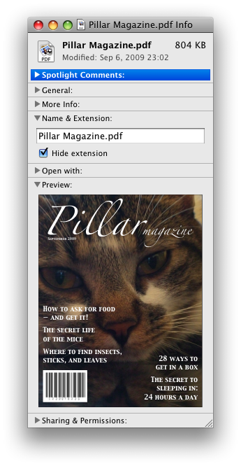
これらの例において、要約はコントロールが変更できるものをまとめたものであり、理想に満たない実際値ではない。
次の例は、排他的なアコーディオンの作成に使用されているdetails要素のname属性を示す。このアコーディオンは、ユーザーが1つのdetails要素を開くと、開いているdetailsが閉じるdetails要素のセットである。
< section class = "characteristics" >
< details name = "frame-characteristics" >
< summary > Material</ summary >
The picture frame is made of solid oak wood.
</ details >
< details name = "frame-characteristics" >
< summary > Size</ summary >
The picture frame fits a photo 40cm tall and 30cm wide.
The frame is 45cm tall, 35cm wide, and 2cm thick.
</ details >
< details name = "frame-characteristics" >
< summary > Color</ summary >
The picture frame is available in its natural wood
color, or with black stain.
</ details >
</ section > 次の例は、要素セットの一部であるdetails要素にopen属性を設定し、name属性を使用して排他的アコーディオンを作成した場合の結果を示している。
最初のマークアップの場合:
< section class = "characteristics" >
< details name = "frame-characteristics" id = "d1" open > ...</ details >
< details name = "frame-characteristics" id = "d2" > ...</ details >
< details name = "frame-characteristics" id = "d3" > ...</ details >
</ section > スクリプト:
document. getElementById( "d2" ). setAttribute( "open" , "" ); スクリプトの実行後に生成されるツリーは、マークアップと同じになる:
< section class = "characteristics" >
< details name = "frame-characteristics" id = "d1" > ...</ details >
< details name = "frame-characteristics" id = "d2" open > ...</ details >
< details name = "frame-characteristics" id = "d3" > ...</ details >
</ section > なぜなら、open属性をd2に設定すると、d1から削除されるからである。
ユーザーがd2内のsummary要素をアクティブにした場合も同様である。
ユーザーがコントロールを操作するために自動的にopen属性が追加および削除されるので、この属性の状態に基づく異なる、この属性CSSで要素に使用できる。ここでは、スタイルシートを使用して、要素を開いたり閉じたりしたときのsummaryの色をアニメーションさせている:
< style >
details > summary { transition : color 1 s ; color : black ; }
details [ open ] > summary { color : red ; }
</ style >
< details >
< summary > Automated Status: Operational</ summary >
< p > Velocity: 12m/s</ p >
< p > Direction: North</ p >
</ details > summary要素Support in all current engines.
details要素の最初の子として。HTMLElementを使用する。summary要素は、もしあれば、summary要素の親details要素に属する残りの内容のキャプションまたは凡例を表す。
A summary element is a summary for its parent details if the following algorithm returns true:
The activation behavior of summary elements is to run the following steps:
If this summary element is not the summary for its parent details, then return.
Let parent be this summary element's parent.
If the open attribute is present on parent, then remove it. Otherwise, set parent's open attribute to the empty string.
This will then run the details notification task steps.
コマンドは、メニュー項目、ボタン、リンクの背後に抽象化したものである。一度コマンドが定義されると、インターフェイスの他の部分は、Disabled状態のようなファセットを共有するために単一の機能へ多くのアクセスポイントを許可し、同じコマンドを参照できる。
コマンドは、次のファセットを持つように定義される:
ユーザーエージェントは、次の条件に一致するコマンドを公開してもよい:
The facet is false (visible).
要素は、nullでないブラウジングコンテキストをもつ文書内である。
要素もその祖先のいずれも指定された属性を持たない。
ユーザーエージェントは、ユーザーにこれらのキーを通知するための方法として、アクセスキーを持つコマンドのために特にこれを行うことが推奨される。
たとえば、そのようなコマンドは、ユーザーエージェントのメニューバーにリストされるかもしれない。
a element to define a commandAn a element with an href attribute defines a command.
The Label of the command is the element's descendant text content.
The Access Key of the command is the element's assigned access key, if any.
The of the command is true (hidden) if the element has a attribute, and false otherwise.
The Disabled State facet of the command is true if the element or one of its ancestors is inert, and false otherwise.
The Action of the command is to fire a click event at the element.
button element to define a commandA button element always defines a command.
The Label, Access Key, , and Action facets of the command are determined as for a elements (see the previous section).
The Disabled State of the command is true if the element or one of its ancestors is inert, or if the element's disabled state is set, and false otherwise.
input element to define a commandAn input element whose type attribute is in one of the Submit Button, Reset Button, Image Button, Button, Radio Button, or Checkbox states defines a command.
The Label of the command is determined as follows:
If the type attribute is in one of the Submit Button, Reset Button, Image Button, or Button states, then the Label is the string given by the value attribute, if any, and a UA-dependent, locale-dependent value that the UA uses to label the button itself if the attribute is absent.
Otherwise, if the element is a labeled control, then the Label is the descendant text content of the first label element in tree order whose labeled control is the element in question. (In JavaScript terms, this is given by element.labels[0].textContent.)
Otherwise, if the value attribute is present, then the Label is the value of that attribute.
Otherwise, the Label is the empty string.
Even though the value attribute on input elements in the Image Button state is non-conformant, the attribute can still contribute to the Label determination, if it is present and the Image Button's alt attribute is missing.
The Access Key of the command is the element's assigned access key, if any.
The of the command is true (hidden) if the element has a attribute, and false otherwise.
The Disabled State of the command is true if the element or one of its ancestors is inert, or if the element's disabled state is set, and false otherwise.
The Action of the command is to fire a click event at the element.
option element to define a commandAn option element with an ancestor select element and either no value attribute or a value attribute that is not the empty string defines a command.
The Label of the command is the value of the option element's label attribute, if there is one, or else the option element's descendant text content, with ASCII whitespace stripped and collapsed.
The Access Key of the command is the element's assigned access key, if any.
The of the command is true (hidden) if the element has a attribute, and false otherwise.
The Disabled State of the command is true if the element is disabled, or if its nearest ancestor select element is disabled, or if it or one of its ancestors is inert, and false otherwise.
If the option's nearest ancestor select element has a multiple attribute, the Action of the command is to toggle the option element. Otherwise, the Action is to pick the option element.
accesskey attribute on a legend element to define a commandA legend element defines a command if all of the following are true:
It has an assigned access key.
It is a child of a fieldset element.
Its parent has a descendant that defines a command that is neither a label element nor a legend element. This element, if it exists, is the legend element's accesskey delegatee.
The Label of the command is the element's descendant text content.
The Access Key of the command is the element's assigned access key.
The , Disabled State, and Action facets of the command are the same as the respective facets of the legend element's accesskey delegatee.
In this example, the legend element specifies an accesskey, which, when activated, will delegate to the input element inside the legend element.
< fieldset >
< legend accesskey = p >
< label > I want < input name = pizza type = number step = 1 value = 1 min = 0 >
pizza(s) with these toppings</ label >
</ legend >
< label >< input name = pizza-cheese type = checkbox checked > Cheese</ label >
< label >< input name = pizza-ham type = checkbox checked > Ham</ label >
< label >< input name = pizza-pineapple type = checkbox > Pineapple</ label >
</ fieldset > accesskey attribute to define a command on other elementsAn element that has an assigned access key defines a command.
If one of the earlier sections that define elements that define commands define that this element defines a command, then that section applies to this element, and this section does not. Otherwise, this section applies to that element.
The Label of the command depends on the element. If the element is a labeled control, the descendant text content of the first label element in tree order whose labeled control is the element in question is the Label (in JavaScript terms, this is given by element.labels[0].textContent). Otherwise, the Label is the element's descendant text content.
The Access Key of the command is the element's assigned access key.
The of the command is true (hidden) if the element has a attribute, and false otherwise.
The Disabled State of the command is true if the element or one of its ancestors is inert, and false otherwise.
The Action of the command is to run the following steps:
click event at the element.dialog要素Support in all current engines.
Support in all current engines.
Support in all current engines.
closedby — ダイアログを閉じるユーザーアクションopen — ダイアログボックスが見えるかどうか[Exposed =Window ]
interface HTMLDialogElement : HTMLElement {
[HTMLConstructor ] constructor ();
[CEReactions , Reflect ] attribute boolean open ;
attribute DOMString returnValue ;
[CEReactions , ReflectSetter ] attribute DOMString closedBy ;
[CEReactions ] undefined show ();
[CEReactions ] undefined showModal ();
[CEReactions ] undefined close (optional DOMString returnValue );
[CEReactions ] undefined requestClose (optional DOMString returnValue );
};dialog要素は、小さいウィンドウ("ダイアログボックス")の形式で、ユーザーはこのウィンドウを操作してタスクを実行したり、情報を収集したりする、アプリケーションの一時的な部分を表す。ユーザーが終了すると、ダイアログはアプリケーションによって自動的に閉じる、またはユーザーによって手動で閉じることができる。
すべてのタイプのアプリケーションでおなじみのパターンである、特にモーダルダイアログの場合、著者は、ウェブアプリケーション内のダイアログが、非ウェブアプリケーションのユーザーにも馴染みのある方法で動作するように保証すべきである。
すべてのHTML要素と同様に、別のタイプのコントロールを表現しようとするときにdialog要素を使用することは適合しない。たとえば、コンテキストメニュー、ツールチップ、ポップアップリストボックスは、ダイアログボックスではないため、これらのパターンを実装するためにdialog要素を乱用することは正しくない。
ユーザー向けダイアログの動作で重要な部分は、初期のフォーカスの配置である。ダイアログフォーカスステップは、ダイアログが表示されたときに初期のフォーカスの適切な候補を選択しようするが、特定のダイアログに対するユーザーの期待に沿う正確な選択を慎重に検討する著者の代わりにはならないかもしれない。そのため、著者は、ダイアログが開いた後にユーザーがすぐに対話することが期待されるダイアログの子孫要素に対して、autofocus属性を使用すべきである。そのような要素がない場合、著者はdialog要素自体にautofocus属性を使用すべきである。
次の例では、在庫管理ウェブアプリケーションで製品の詳細を編集するためにダイアログが使用される。
< dialog >
< label > Product Number < input type = "text" readonly ></ label >
< label > Product Name < input type = "text" autofocus ></ label >
</ dialog > autofocus属性が存在しない場合、Product Numberフィールドはダイアログフォーカスステップによってフォーカスされる。これは合理的な動作であるが、Product Numberフィールドは読み取り専用であり、ユーザー入力を想定していないため、Product Nameフィールドにフォーカスを当てる方が適切であると著者は判断した。そこで、著者はデフォルトを上書きするためにオートフォーカスを使用した。
たとえ著者がデフォルトでProduct Numberフィールドにフォーカスしたいとしても、input要素にオートフォーカスを使用して明示的に指定するのが最良である。これは、コードの将来の読者に対して意図を明確にし、将来の更新に対してコードが堅牢であり続けることを保証する。(たとえば、別の開発者が閉じるボタンを追加し、ノードツリーのProduct Numberフィールドの前に配置した場合)。
ユーザー動作のもう1つの重要な側面は、ダイアログがスクロール可能かどうかということである。場合によっては、オーバーフロー(つまりスクロール可能性)は、例えば、ユーザーの高いテキストズーム設定によって引き起こされる場合、回避することができない。しかし一般に、スクロール可能なダイアログはユーザーには期待されない。大きなテキストノードをダイアログ要素に直接追加すると、ダイアログ要素自体がオーバーフローする可能性があるため、特に問題が多い。著者はそれらを避けるのが最善である。
次のサービス条件のダイアログでは、上記の提案を尊重する。
< dialog style = "height: 80vh;" >
< div style = "overflow: auto; height: 60vh;" autofocus >
< p > By placing an order via this Web site on the first day of the fourth month of the year
2010 Anno Domini, you agree to grant Us a non-transferable option to claim, for now and for
ever more, your immortal soul.</ p >
< p > Should We wish to exercise this option, you agree to surrender your immortal soul,
and any claim you may have on it, within 5 (five) working days of receiving written
notification from this site or one of its duly authorized minions.</ p >
<!-- ... etc., with many more <p> elements ... -->
</ div >
< form method = "dialog" >
< button type = "submit" value = "agree" > Agree</ button >
< button type = "submit" value = "disagree" > Disagree</ button >
</ form >
</ dialog > ダイアログフォーカスステップは、デフォルトでスクロール可能なdiv要素が選択されるが、直前の例と同様に、将来の変更に対してより明確で堅牢になるように、autofocusをdivに配置した。
対照的に、利用規約を表すp要素にそのようなラッパーdiv要素がない場合、dialog自身がスクロール可能になり、上記のアドバイスに違反する。さらに、autofocus属性が存在しない場合、そのようなマークアップパターンは上記のアドバイスに違反し、ダイアログフォーカスステップのデフォルト動作を中断させ、フォーカスがAgree buttonにジャンプする原因となる。これは、悪いユーザー体験となる。
このダイアログボックスは、いくつかの小さなプリントを持つ。strong要素は、より重要な部分にユーザーの注意を引くために使用される。
< dialog >
< h1 > Add to Wallet</ h1 >
< p >< strong >< label for = amt > How many gold coins do you want to add to your wallet?</ label ></ strong ></ p >
< p >< input id = amt name = amt type = number min = 0 step = 0.01 value = 100 ></ p >
< p >< small > You add coins at your own risk.</ small ></ p >
< p >< label >< input name = round type = checkbox > Only add perfectly round coins</ label ></ p >
< p >< input type = button onclick = "submit()" value = "Add Coins" ></ p >
</ dialog > open属性は、真偽属性である。指定される場合、dialog要素はアクティブであり、ユーザーが操作できることを示す。
closedbyコンテンツ属性は、次のキーワードと状態をもつ列挙属性である:
| キーワード | 状態 | 概要 |
|---|---|---|
any | Any | 閉じ要求または外部をクリックしてダイアログを閉じる。 |
closerequest | Close Request | 閉じ要求はダイアログを閉じる。 |
none | None | ダイアログを自動的に閉じるユーザー操作はない。 |
closedby属性の不正値のデフォルトと欠損値のデフォルトの両方は、Auto状態である。
Auto状態は、dialogがそのshowModal()メソッドを使用して表示された場合、閉じ要求状態として動作し、そうでなければNone状態として動作する。
open属性が指定されないdialog要素は、ユーザーに表示されるべきでない。この要件は、スタイルレイヤーを通して間接的に実装されてもよい。たとえば、推奨されるデフォルトのレンダリングをサポートするユーザーエージェントは、Renderingセクションで説明されるCSSルールを使用してこの要件を実装する。
open属性を削除すると、通常ダイアログが非表示になる。しかし、そのようにすると、いくつかの奇妙な追加の結果となる:
closeイベントは発火しない。
showModal()メソッドを使用してダイアログが表示された場合、Documentはブロックされる。
これらの理由から、open属性を手動で削除しない方が一般的には良い方法である。代わりに、ダイアログを閉じるためにclose()もしくはclose()メソッドを使用する、または非表示にするために属性を使用する。
tabindex属性は、dialog要素で指定されてはならない。
dialog.show()Support in all current engines.
dialog要素を表示する。
dialog.showModal()Support in all current engines.
dialog要素を表示し、一番上のモーダルダイアログにする。
この方法は、autofocus属性を履行する。
dialog.close([ result ])Support in all current engines.
dialog要素を閉じる。
引数が与えられた場合、戻り値を提供する。
dialog.requestClose([ result ])最初にcancelイベントを発火し、そのイベントがpreventDefault()でキャンセルされない場合、close()メソッドと同じ方法でdialogを閉じる(closeイベントの起動を含む)。これにより、dialogをターゲットとして閉じ要求が送信されたかのように動作する。
これは、キャンセルおよびクローズロジックをcancelおよびcloseイベントハンドラーに統合するために使用できるヘルパーユーティリティであり、非close requestのすべてのクローズアフォーダンスでこのメソッドを呼び出すことができる。
このメソッドはclosedby属性を無視する。つまり、closedbyが"none"に設定されていても、同じ動作が適用される。
引数が与えられた場合、戻り値を提供する。
dialog.returnValue [ = result ]Support in all current engines.
dialogの戻り値を返す。
戻り値を更新する設定が可能である。
The show() method steps are:
If this has an open attribute and is modal of this is false, then return.
If this has an open attribute, then throw an "InvalidStateError" DOMException.
If the result of firing an event named beforetoggle, using ToggleEvent, with the cancelable attribute initialized to true, the oldState attribute initialized to "closed", and the newState attribute initialized to "open" at this is false, then return.
Queue a dialog toggle event task given this, "closed", "open", and null.
Add an open attribute to this, whose value is the empty string.
Set this's previously focused element to the focused element.
Let document be this's node document.
Let hideUntil be the result of running topmost popover ancestor given this, null, and false.
Run hide popovers until given document, hideUntil, false, and true.
Run the dialog focusing steps given this.
The showModal() method steps are to show a modal dialog given this and null.
The close(returnValue) method steps are:
If returnValue is not given, then set it to null.
Close the dialog this with returnValue and null.
The requestClose(returnValue) method steps are:
If returnValue is not given, then set it to null.
Request to close the dialog this with returnValue and null.
次の制約により、表示する/隠す(show/hide)や開く/閉じる(open/close)などの対義語として一般的に考えられている動詞のペアとは対照的に、dialog要素の動詞として表示する/閉じる(show/close)を使用する:
ダイアログを非表示にすることは、ダイアログを閉じることとは異なる。ダイアログを閉じると、戻り値が返され、イベントが発火し、他のダイアログのページのブロックが解除される、などする。ダイアログを非表示にすることは純粋に視覚的なプロパティであり、属性を使用するか、open属性を削除することですでに実行できることである。(open属性を削除すること、およびそのようにダイアログを非表示にすることは一般的に望ましくないことについては、上記の注も参照。)
ダイアログを表示することは、ダイアログを開くこととは異なる。ダイアログを開くことは、そのダイアログを作成して、表示することである(window.open()が新しいウィンドウを作成して表示する方法と同様である)。ダイアログの表示は、すでにDOMにあるdialog要素を取得し、それをインタラクティブにしてユーザーに可視にするプロセスである。
上記にもかかわらずdialog.open()メソッドがあるとすれば、dialog.openプロパティと競合するだろう。
さらに、dialog要素のもとのデザインと同時代の他の多くのUIフレームワークの調査により、表示する/閉じる(show/close)の動詞のペアがかなり一般的であることが明らかになった。
要約すると、特定の動詞の意味、およびそれらの動詞が技術的なコンテキストでどのように使用されるかは、ダイアログの表示と閉じるなどのペアの動作が必ずしも対義語として表現できるとは限らないことがわかる。
The returnValue IDL attribute, on getting, must return the last value to which it was set. On setting, it must be set to the new value. When the element is created, it must be set to the empty string.
The closedBy getter steps are to return the keyword corresponding to the computed closed-by state given this.
Each Document has a dialog pointerdown target, which is an HTML dialog element or null, initially null.
Each HTML element has a previously focused element which is null or an element, and it is initially null. When showModal() and show() are called, this element is set to the currently focused element before running the dialog focusing steps. Elements with the popover attribute set this element to the currently focused element during the show popover algorithm.
Each dialog element has a dialog toggle task tracker, which is a toggle task tracker or null, initially null.
Each dialog element has a close watcher, which is a close watcher or null, initially null.
Each dialog element has a request close return value, which is a string or null, initially null.
Each dialog element has a request close source element, which is an Element or null, initially null.
Each dialog element has an enable close watcher for request close boolean, initially false.
dialog's enable close watcher for request close is used to force enable the dialog's close watcher while requesting to close it. A dialog whose computed closed-by state is the None state would otherwise have a disabled close watcher.
Each dialog element has an is modal boolean, initially false.
The dialog HTML element insertion steps, given insertedNode, are:
If insertedNode's node document is not fully active, then return.
If insertedNode has an open attribute and is connected, then run the dialog setup steps given insertedNode.
The dialog HTML element removing steps, given removedNode, isSubtreeRoot, and oldAncestor are:
If removedNode has an open attribute, then run the dialog cleanup steps given removedNode.
If removedNode's node document's top layer contains removedNode, then remove an element from the top layer immediately given removedNode.
Set is modal of removedNode to false.
The following attribute change steps, given element, localName, oldValue, value, and namespace are used for dialog elements:
If namespace is not null, then return.
If localName is not open, then return.
If value is null and oldValue is not null, then run the dialog cleanup steps given element.
If element's node document is not fully active, then return.
If element is not connected, then return.
This ensures that the dialog setup steps are not run on nodes that are disconnected, which would result in a close watcher being established. The dialog cleanup steps need no such guard.
If value is not null and oldValue is null, then run the dialog setup steps given element.
To show a modal dialog given a dialog element subject and an Element or null source:
If subject has an open attribute and is modal of subject is true, then return.
If subject has an open attribute, then throw an "InvalidStateError" DOMException.
If subject's node document is not fully active, then throw an "InvalidStateError" DOMException.
If subject is not connected, then throw an "InvalidStateError" DOMException.
If subject is in the popover showing state, then throw an "InvalidStateError" DOMException.
If the result of firing an event named beforetoggle, using ToggleEvent, with the cancelable attribute initialized to true, the oldState attribute initialized to "closed", the newState attribute initialized to "open", and the source attribute initialized to source at subject is false, then return.
If subject has an open attribute, then return.
If subject is not connected, then return.
If subject is in the popover showing state, then return.
Queue a dialog toggle event task given subject, "closed", "open", and source.
Add an open attribute to subject, whose value is the empty string.
Assert: subject's close watcher is not null.
Set is modal of subject to true.
Set subject's node document to be blocked by the modal dialog subject.
This will cause the focused area of the document to become inert (unless that currently focused area is a shadow-including descendant of subject). In such cases, the focused area of the document will soon be reset to the viewport. In a couple steps we will attempt to find a better candidate to focus.
If subject's node document's top layer does not already contain subject, then add an element to the top layer given subject.
Set subject's previously focused element to the focused element.
Let document be subject's node document.
Let hideUntil be the result of running topmost popover ancestor given subject, null, and false.
Run hide popovers until given document, hideUntil, false, and true.
Run the dialog focusing steps given subject.
To set the dialog close watcher, given a dialog element dialog:
Assert: dialog's close watcher is null.
Assert: dialog has an open attribute and dialog's node document is fully active.
Set dialog's close watcher to the result of establishing a close watcher given dialog's relevant global object, with:
cancelAction given canPreventClose being to return the result of firing an event named cancel at dialog, with the cancelable attribute initialized to canPreventClose.
closeAction being to close the dialog given dialog, dialog's request close return value, and dialog's request close source element.
getEnabledState being to return true if dialog's enable close watcher for request close is true or dialog's computed closed-by state is not None; otherwise false.
The is valid command steps for dialog elements, given a command attribute command, are:
If command is in the Close state, the Request Close state, or the Show Modal state, then return true.
falseを返す。
The command steps for dialog elements, given an element element, an element source, and a command attribute command, are:
If element is in the popover showing state, then return.
If command is in the Close state and element has an open attribute, then close the dialog element with source's optional value and source.
If command is in the Request Close state and element has an open attribute, then request to close the dialog element with source's optional value and source.
If command is the Show Modal state and element does not have an open attribute, then show a modal dialog given element and source.
The following buttons use commandfor to open and close a "confirm" dialog as modal when activated:
< button type = button
commandfor = "the-dialog"
command = "show-modal" >
Delete
</ button >
< dialog id = "the-dialog" >
< form action = "/delete" method = "POST" >
< button type = "submit" >
Delete
</ button >
< button commandfor = "the-dialog"
command = "close" >
Cancel
</ button >
</ form >
</ dialog >
When a dialog element subject is to be closed, with null or a string result and an Element or null source, run these steps:
If subject does not have an open attribute, then return.
Fire an event named beforetoggle, using ToggleEvent, with the oldState attribute initialized to "open", the newState attribute initialized to "closed", and the source attribute initialized to source at subject.
If subject does not have an open attribute, then return.
Queue a dialog toggle event task given subject, "open", "closed", and source.
Remove subject's open attribute.
If is modal of subject is true, then request an element to be removed from the top layer given subject.
Let wasModal be the value of subject's is modal flag.
Set is modal of subject to false.
If result is not null, then set subject's returnValue attribute to result.
Set subject's request close return value to null.
Set subject's request close source element to null.
If subject's previously focused element is not null:
Let element be subject's previously focused element.
Set subject's previously focused element to null.
If subject's node document's focused area of the document's DOM anchor is a shadow-including inclusive descendant of subject, or wasModal is true, then run the focusing steps for element; the viewport should not be scrolled by doing this step.
Queue an element task on the user interaction task source given the subject element to fire an event named close at subject.
To request to close dialog element subject, given null or a string returnValue and null or an Element source:
If subject does not have an open attribute, then return.
If subject is not connected or subject's node document is not fully active, then return.
Assert: subject's close watcher is not null.
Set subject's enable close watcher for request close to true.
Set subject's request close return value to returnValue.
Set subject's request close source element to source.
Request to close subject's close watcher with false.
Set subject's enable close watcher for request close to false.
To queue a dialog toggle event task given a dialog element element, a string oldState, a string newState, and an Element or null source:
If element's dialog toggle task tracker is not null:
Set oldState to element's dialog toggle task tracker's old state.
Remove element's dialog toggle task tracker's task from its task queue.
Set element's dialog toggle task tracker to null.
Queue an element task given the DOM manipulation task source and element to run the following steps:
Fire an event named toggle at element, using ToggleEvent, with the oldState attribute initialized to oldState, the newState attribute initialized to newState, and the source attribute initialized to source.
Set element's dialog toggle task tracker to null.
Set element's dialog toggle task tracker to a struct with task set to the just-queued task and old state set to oldState.
To retrieve a dialog's computed closed-by state, given a dialog dialog:
The dialog focusing steps, given a dialog element subject, are as follows:
If the allow focus steps given subject's node document return false, then return.
Let control be null.
If subject has the autofocus attribute, then set control to subject.
If control is null, then set control to the focus delegate of subject.
If control is null, then set control to subject.
Run the focusing steps for control.
If control is not focusable, this will do nothing. This would only happen if subject had no focus delegate, and the user agent decided that dialog elements were not generally focusable. In that case, any earlier modifications to the focused area of the document will apply.
Let topDocument be control's node navigable's top-level traversable's active document.
If control's node document's origin is not the same as the origin of topDocument, then return.
Empty topDocument's autofocus candidates.
Set topDocument's autofocus processed flag to true.
The dialog setup steps, given a dialog element subject, are as follows:
Assert: subject's node document's open dialogs list does not contain subject.
Add subject to subject's node document's open dialogs list.
Set the dialog close watcher with subject.
The dialog cleanup steps, given a dialog element subject, are as follows:
Remove subject from subject's node document's open dialogs list.
If subject's close watcher is not null:
Destroy subject's close watcher.
Set subject's close watcher to null.
"Light dismiss" means that clicking outside of a dialog element whose closedby attribute is in the Any state will close the dialog element. This is in addition to how such dialogs respond to close requests.
To light dismiss open dialogs, given a PointerEvent event:
Let document be event's target's node document.
If document's open dialogs list is empty, then return.
Let ancestor be the result of running nearest clicked dialog given event.
If event's type is "pointerdown", then set document's dialog pointerdown target to ancestor.
If event's type is "pointerup":
Let sameTarget be true if ancestor is document's dialog pointerdown target.
Set document's dialog pointerdown target to null.
If sameTarget is false, then return.
Let topmostDialog be the last element of document's open dialogs list.
If ancestor is topmostDialog, then return.
If topmostDialog's computed closed-by state is not Any, then return.
Assert: topmostDialog's close watcher is not null.
Request to close topmostDialog's close watcher with false.
To run light dismiss activities, given a PointerEvent event:
Run light dismiss open popovers with event.
Run light dismiss open dialogs with event.
Run light dismiss activities will be called by the Pointer Events spec when the user clicks or touches anywhere on the page.
To find the nearest clicked dialog, given a PointerEvent event:
Let target be event's target.
If target is a dialog element, target has an open attribute, target's is modal is true, and event's clientX and clientY are outside the bounds of target, then return null.
The check for clientX and clientY is because a pointer event that hits the ::backdrop pseudo element of a dialog will result in event having a target of the dialog element itself.
Let currentNode be target.
While currentNode is not null:
Return null.