HTML: The Living Standard
Edition for Web Developers — Last Updated 18 July 2026
Edition for Web Developers — Last Updated 18 July 2026
button要素Support in all current engines.
select要素の最初の子として。tabindex属性が指定された子孫が存在してはならない。If the element is the first child of a select element, then it may also have one descendant selectedcontent element.command — 実行するアクションをターゲット要素に指示する。commandfor — 呼び出される別の要素をターゲットにする。disabled — フォームコントロールが無効であるかどうかform — form要素とこの要素を関連付けるformaction — フォーム送信に使用するURLformenctype — フォーム送信に使用するエントリーリストのエンコーディングタイプformmethod — フォーム送信に使用する変形formnovalidate — フォーム送信のためのフォームコントロール検証を回避するformtarget — フォーム送信に対するナビゲート可能name — フォーム送信およびform.elements APIで使用する要素の名前popovertarget — ポップオーバー要素を切り替え、表示、または非表示にするターゲットとするpopovertargetaction — ターゲットのポップオーバー要素を切り替える、表示する、または非表示にするかを示すtype — ボタンの種類value — フォーム送信に対して使用される値formaction.HTMLButtonElementを使用する。button要素は要素のコンテンツによって分類されるボタンを表す。
要素はボタンである。
type属性は、アクティブにされたときのボタンの振る舞いを制御する。属性は、次のキーワードと状態を持つ列挙属性である:
| キーワード | 状態 | 概要 |
|---|---|---|
submit | Submit Button | フォームを送信する。 |
reset | Reset Button | フォームをリセットする。 |
button | Button | 何もしない。 |
button要素は、次のいずれかに該当する場合、送信ボタンと呼ばれる:
type属性がAuto状態であり、commandとcommandforの両方のコンテンツ属性が存在せず、parentノードがselect要素でない。または
type属性がSubmit Button状態になっている
制約の検証:要素が送信ボタンでない場合、要素は制約の検証から除外される。
button要素が、select要素の要素である最初の子である場合、inertになる。
指定する場合、commandfor属性値は、commandfor属性をもつ buttonと同じツリー内の要素のIDでなければならない。
command属性は、次のキーワードと状態を持つ列挙属性である:
| キーワード | 状態 | 概要 |
|---|---|---|
toggle-popover | Toggle Popover | ターゲットのpopover要素を表示または非表示する。 |
show-popover | Show Popover | ターゲットのpopover要素を表示する。 |
hide-popover | Hide Popover | ターゲットのpopover要素を非表示にする。 |
close | Close | ターゲットのdialog要素を閉じる。 |
request-close | Request Close | ターゲットのdialog要素を閉じるように要求する。 |
show-modal | Show Modal | ターゲットのdialog要素を開く。 |
| A custom command keyword | Custom | ターゲット要素でcommandイベントのみを送出する。 |
カスタムコマンドキーワードは、"--"で始まる文字列である。
form属性は、フォームの所有者とbutton要素を明示的に関連付けるために使用される。name属性は要素の名前を表す。disabled属性は、コントロールが非対話的にするためおよびその値を送信するのを防ぐために使用される。formaction、formenctype、formmethod、formnovalidateおよびformtarget属性は、フォーム送信用の属性である。
formnovalidate属性は、制約検証をトリガーしない送信ボタンを作成するために使用することができる。
要素が送信ボタンでない場合、formaction、formenctype 、formmethod、formnovalidate、formtargetを指定してはならない。
The command getter steps are:
value属性はフォーム送信の目的のために要素の値を与える。要素の値は、要素のvalue 属性がある場合はその属性の値、ない場合は空文字列である。要素のオプション値は、要素のvalue属性がある場合はその値、それ以外の場合はnullである。
ボタン自体がフォームの送信を開始するために使用された場合、ボタン(およびその値)はフォームの送信にのみ含まれる。
次のボタンは、アクティブにされたときに、"Show hint"のラベルをもち、ダイアログボックスがポップアップ表示される:
< button type = button
onclick = "alert('This 15-20 minute piece was composed by George Gershwin.')" >
Show hint
</ button > 次に、ボタンがcommandforを使用して、popover属性がアクティブなときに要素を表示または非表示にする方法を示す。
< button type = button
commandfor = "the-popover"
command = "show-popover" >
Show menu
</ button >
< div popover
id = "the-popover" >
< button commandfor = "the-popover"
command = "hide-popover" >
Hide menu
</ button >
</ div >
次に、ボタンが要素でカスタムコマンドキーワードとともにcommandforを使用する方法を示し、指定されていない動作に対してカスタムコマンドを使用する方法を示す:
< button type = button
commandfor = "the-image"
command = "--rotate-landscape" >
Rotate Left
</ button >
< button type = button
commandfor = "the-image"
command = "--rotate-portrait" >
Rotate Right
</ button >
< img id = "the-image"
src = "photo.jpg" >
< script >
const image = document. getElementById( "the-image" );
image. addEventListener( "command" , ( event) => {
if ( event. command == "--rotate-landscape" ) {
event. target. style. rotate = "-90deg"
} else if ( event. command == "--rotate-portrait" ) {
event. target. style. rotate = "0deg"
}
});
</ script >
select要素Support in all current engines.
button elements if the select is a drop-down box, followed by zero or more option elements, optgroup elements, hr elements, script-supporting elements, noscript elements, or div elements.autocomplete — フォームオートフィル機能に対するヒントdisabled — フォームコントロールが無効であるかどうかform — form要素とこの要素を関連付けるmultiple — 複数の値を許可するかどうかname — フォーム送信およびform.elements APIで使用する要素の名前required — コントロールがフォーム送信に要求されるかどうかsize — コントロールのサイズmultiple属性を持つ、または1より大きい値をもつsizeを持つ場合:著者向け、実装者向け。HTMLSelectElementを使用する。select要素は、選択肢の集合の中で選択するためのコントロールを表す。
Support in all current engines.
multiple属性は真偽属性である。属性が存在する場合、select要素は、選択肢のリストから0個以上の選択肢を選択するためのコントロールを表す。属性が存在しない場合、select要素は、選択肢のリストから1つの選択肢を選択するためのコントロールを表す。
Support in all current engines.
size属性は、ユーザーに表示するための選択肢の数を与える。size属性が指定される場合、0より大きい妥当な負でない整数である値を持たなければならない。
Support in all current engines.
required属性は真偽属性である。指定される場合、ユーザーがフォームを送信する前に値を選択する必要がある。
form属性は、フォームの所有者とselect要素を明示的に関連付けるために使用される。name属性は要素の名前を表す。disabled属性は、コントロールが非対話的にするためおよびその値を送信するのを防ぐために使用される。autocomplete属性は、どのようにユーザーエージェントがオートフィルの振る舞いを提供するかを制御する。
select要素にrequired属性が指定されており、表示サイズが1である場合、およびselect要素のオプションリスト内の最初のoption要素のvalueが空の文字列であり(存在する場合)、option要素の親ノードがselect要素である場合(ただし、optgroup要素ではない)、optionは、selectのプレースホルダーラベルオプションである。
select要素がrequired属性を指定され、multiple属性を指定されず、1である表示サイズを持つ場合、そのselect要素は、プレースホルダーのラベルオプションを持たなければならない。
実際には、上の段落で述べた要件は、select要素が1より大きい値をもつsize属性を持たない場合にのみ適用することができる。
select.type要素がmultiple属性を持つ場合、"select-multiple"を返し、そうでなければ"select-one"を返す。
select.options選択肢のリストのHTMLOptionsCollectionを返す。
select.length [ = value ]選択肢のリストの要素数を返す。
element = select.item(index)select[index]選択肢のリストからのインデックスindexとともにアイテムを返す。アイテムはツリー順にソートされる。
element = select.namedItem(name)選択肢のリストからのIDまたはname nameとともに最初のアイテムを返す。
IDをもつ要素が見つからない場合、nullを返す。
select.add(element [, before ])beforeによって与えられるノードの前の要素を挿入する。
before引数は数字でもよく、その場合elementはその数字をもつアイテムの前に挿入され、または選択肢のリストからの要素でもよい。その場合elementはその要素の前に挿入される。
beforeが省略された、null、または範囲外の数字の場合、elementはリストの最後に加えられるだろう。
elementに挿入された要素が親要素である場合、このメソッドは"HierarchyRequestError" DOMExceptionを投げる。
select.selectedOptions選択された選択肢のリストのHTMLOptionsCollectionを返す。
select.selectedIndex [ = value ]もしあるならば、最初に選ばれたアイテムのインデックスを、または選択したアイテムが存在しない場合−1を返す。
選択を変更する設定が可能である。
select.value [ = value ]もしあれば、最初に選択されたアイテムの値を返し、選択されたアイテムが存在しない場合、空文字列を返す。
選択を変更する設定が可能である。
select.showPicker()ユーザーが値を選択できるように、selectの適切なピッカーUIを表示する。
Documentがmutableでない場合、"InvalidStateError" DOMExceptionを投げる。
一時的なユーザーアクティベーションなしで呼び出された場合、"NotAllowedError" DOMExceptionを投げる。
selectがクロスオリジンiframe内にある場合、"SecurityError" DOMExceptionを投げる。
selectがレンダリングされていない場合、"NotSupportedError" DOMExceptionを投げる。
選択肢の集合からユーザーが1つの選択肢を選択できるselect要素が使用される様子を次に示す。デフォルトの選択肢はあらかじめ選択されている。
< p >
< label for = "unittype" > Select unit type:</ label >
< select id = "unittype" name = "unittype" >
< option value = "1" > Miner </ option >
< option value = "2" > Puffer </ option >
< option value = "3" selected > Snipey </ option >
< option value = "4" > Max </ option >
< option value = "5" > Firebot </ option >
</ select >
</ p > デフォルトの選択肢が存在しない場合、プレースホルダーが代わりに使用される:
< select name = "unittype" required >
< option value = "" > Select unit type </ option >
< option value = "1" > Miner </ option >
< option value = "2" > Puffer </ option >
< option value = "3" > Snipey </ option >
< option value = "4" > Max </ option >
< option value = "5" > Firebot </ option >
</ select > ここでは、ユーザーが選択肢の集合から任意の数を選択できる。デフォルトで、5つすべての選択肢が選択されている。
< p >
< label for = "allowedunits" > Select unit types to enable on this map:</ label >
< select id = "allowedunits" name = "allowedunits" multiple >
< option value = "1" selected > Miner </ option >
< option value = "2" selected > Puffer </ option >
< option value = "3" selected > Snipey </ option >
< option value = "4" selected > Max </ option >
< option value = "5" selected > Firebot </ option >
</ select >
</ p > ときには、ユーザーは1つ以上の項目を選択する必要がある。次の例はそのようなインターフェイスを示す。
< label >
Select the songs from that you would like on your Act II Mix Tape:
< select multiple required name = "act2" >
< option value = "s1" > It Sucks to Be Me (Reprise)
< option value = "s2" > There is Life Outside Your Apartment
< option value = "s3" > The More You Ruv Someone
< option value = "s4" > Schadenfreude
< option value = "s5" > I Wish I Could Go Back to College
< option value = "s6" > The Money Song
< option value = "s7" > School for Monsters
< option value = "s8" > The Money Song (Reprise)
< option value = "s9" > There's a Fine, Fine Line (Reprise)
< option value = "s10" > What Do You Do With a B.A. in English? (Reprise)
< option value = "s11" > For Now
</ select >
</ label > セパレーターを使用すると便利な場合がある:
< label >
Select the song to play next:
< select required name = "next" >
< option value = "sr" > Random
< hr >
< option value = "s1" > It Sucks to Be Me (Reprise)
< option value = "s2" > There is Life Outside Your Apartment
…Here is an example which uses div, legend, img, button, and selectedcontent elements:
< select >
< button >
< selectedcontent ></ selectedcontent >
</ button >
< div class = "border" >
< optgroup >
< legend > WHATWG Specifications</ legend >
< option >
< img src = "html.jpg" alt = "" >
HTML
</ option >
< option >
< img src = "dom.jpg" alt = "" >
DOM
</ option >
</ optgroup >
</ div >
< div class = "border" >
< optgroup >
< legend > W3C Specifications</ legend >
< option >
< img src = "forms.jpg" alt = "" >
CSS Form Control Styling
</ option >
< option >
< img src = "pseudo.jpg" alt = "" >
CSS Pseudo-Elements
</ option >
< optgroup >
</ div >
</ select > datalist要素optionおよびスクリプトサポート要素。HTMLDataListElementを使用する。datalist要素は、他のコントロール用にあらかじめ定義された選択肢を表すoption要素の集合を表す。レンダリングにおいて、datalist要素は何もないことを表す。
datalist要素は2つの方法で使用される。最も単純な場合、datalist要素はoption要素の子のみを持つ。
< label >
Animal:
< input name = animal list = animals >
< datalist id = animals >
< option value = "Cat" >
< option value = "Dog" >
</ datalist >
</ label > より手の込んだ場合、datalist要素はdatalistをサポートしないダウンレベルクライアントに対して表示されるコンテンツを与えられる。この場合、option要素はdatalist要素の内側のselect要素の内側で提供される。
< label >
Animal:
< input name = animal list = animals >
</ label >
< datalist id = animals >
< label >
or select from the list:
< select name = animal >
< option value = "" >
< option > Cat
< option > Dog
</ select >
</ label >
</ datalist > datalist要素はinput要素でlist属性を使用するinput要素に接続される。
その値が空文字列でない文字列である、無効でない、datalist要素の子孫である各option要素は、提案を表す。各提案は、値とラベルを持つ。
datalist.optionsdatalistのoption要素のHTMLCollectionを返す。
optgroup要素Support in all current engines.
select要素の子孫として。legend element followed by zero or more option elements, script-supporting elements, noscript elements, or div elements.optgroup要素の直後に別のoptgroup要素が続く場合、その直後にhr要素が続く場合、または親要素にコンテンツがない場合、optgroup要素の終了タグは省略することができる。disabled — フォームコントロールが無効であるかどうかlabel — ユーザー可視ラベルHTMLOptGroupElementを使用する。optgroup要素は、共通のラベルをもつoption要素のグループを表す。
Support in all current engines.
disabled属性は真偽属性であり、一緒にoption要素のグループを無効にするために使用できる。
optgroupが子legend要素を持たない場合、 label属性を指定しなければならない。
To get an optgroup element's label, given an optgroup optgroup:
If optgroup has a child legend element, then return the result of stripping and collapsing ASCII whitespace from the concatenation of data of all the Text node descendants of optgroup's first child legend element, in tree order, excluding any that are descendants of descendants of the legend that are themselves script or SVG script elements.
Otherwise, return the value of optgroup's label attribute.
The value of the optgroup label algorithm gives the name of the group, for the purposes of the user interface.
optgroup要素を選択する方法は存在しない。option要素を選択することができるだけである。optgroup要素は単にoption要素のグループに対するラベルを提供するだけである。
次の断片は、selectドロップダウンウィジェットで3つのコースからレッスンの集合が提供される様子を示す:
< form action = "courseselector.dll" method = "get" >
< p > Which course would you like to watch today?
< p >< label > Course:
< select name = "c" >
< optgroup label = "8.01 Physics I: Classical Mechanics" >
< option value = "8.01.1" > Lecture 01: Powers of Ten
< option value = "8.01.2" > Lecture 02: 1D Kinematics
< option value = "8.01.3" > Lecture 03: Vectors
< optgroup label = "8.02 Electricity and Magnetism" >
< option value = "8.02.1" > Lecture 01: What holds our world together?
< option value = "8.02.2" > Lecture 02: Electric Field
< option value = "8.02.3" > Lecture 03: Electric Flux
< optgroup label = "8.03 Physics III: Vibrations and Waves" >
< option value = "8.03.1" > Lecture 01: Periodic Phenomenon
< option value = "8.03.2" > Lecture 02: Beats
< option value = "8.03.3" > Lecture 03: Forced Oscillations with Damping
</ select >
</ label >
< p >< input type = submit value = "▶ Play" >
</ form > option要素Support in all current engines.
select要素の子孫として。datalist要素の子孫として。optgroup要素の子孫として。label属性およびvalue属性を持つ場合:Nothing。label属性を持つがvalue属性を持たない場合:テキスト。label attribute and is not a descendant of a datalist element: Zero or more div elements or phrasing content, but there must be no interactive content descendant, datalist element descendant, object element descendant, or descendant with the tabindex attribute specifiedlabel属性を持たず、かつdatalist要素の子孫である場合:Text。option要素の直後に別のoption要素が続く場合、optgroup要素が続く場合、hr要素が続く場合、または親要素にコンテンツがない場合、option要素の終了タグは省略することができる。disabled — フォームコントロールが無効であるかどうかlabel — ユーザー可視ラベルselected — デフォルトで選択肢が選択されるかどうかvalue — フォーム送信に対して使用される値HTMLOptionElementを使用する。option要素は、select要素でまたはdatalist要素で提案のリストの一部として選択肢を表す。
selectの定義で記載されるある特定の状況において、option要素は、select要素のプレースホルダーのラベルオプションとなることができる。プレースホルダーのラベルオプションは、実際の選択肢を表さないが、selectコントロールのラベルを表す。
Support in all current engines.
disabled属性は、真偽属性である。An option element option is disabled if the following steps return true:
If option's disabled attribute is present, then return true.
For each ancestor of option's ancestors in reverse tree order:
falseを返す。
無効にしても、option要素に対するすべての変更が禁止されるわけではない。たとえば、その選択された状態をJavaScriptからプログラムで変更することができます。または、select要素内の他の無効になっていないoption要素が変更された場合など、ユーザーアクションによって間接的に変更される可能性がある。
labelコンテンツ属性が指定される場合、空であってはならない。
value属性は、その要素の値を提供する。option要素のvalueは、valueコンテンツ属性が存在する場合はその値、存在しないない場合はthisおよびfalseを指定したcollect option textの結果である。
selected属性は、真偽属性である。これは、要素のデフォルトselectednessを表す。
multiple属性が指定されないselect要素は、そのselected属性設定を持つ複数の子孫option要素を持ってはならない。
Each option element has a cached nearest ancestor select element, which is a select element or null, initially set to null.
To update an option's nearest ancestor select, given an option option:
Let oldSelect be option's cached nearest ancestor select element.
Let newSelect be option's option element nearest ancestor select.
If oldSelect is not newSelect:
If oldSelect is not null, then run the selectedness setting algorithm given oldSelect.
If newSelect is not null, then run the selectedness setting algorithm given newSelect.
Set option's cached nearest ancestor select element to newSelect.
The option HTML element insertion steps, given insertedOption, are to run update an option's nearest ancestor select given insertedOption.
The option HTML element removing steps, given removedNode, isSubtreeRoot, and oldAncestor are to run update an option's nearest ancestor select given removedNode.
The option HTML element moving steps, given movedNode, isSubtreeRoot, and oldAncestor are to run update an option's nearest ancestor select given movedNode.
To get the nearest ancestor select given an Element element, run these steps. They return a select or null.
Let ancestorOptgroup be null.
For each ancestor of element's ancestors, in reverse tree order:
Return null.
To maybe clone an option into selectedcontent, given an option option:
Let select be option's option element nearest ancestor select.
If all of the following conditions are true:
select is not null;
option's selectedness is true; and
select's enabled selectedcontent is not null,
then run clone an option into a selectedcontent given option and select's enabled selectedcontent.
To clone selected option into select button, given a select element select:
Let option be the first element of select's option list whose selectedness is set to true, if such an element exists; otherwise null.
Let text be the empty string.
If option is not null, then set text to option's label.
Set select's select fallback button text to text.
When an option element is popped off the stack of open elements of an HTML parser or XML parser, the user agent must run maybe clone an option into selectedcontent given the option element.
option.selected要素が選択される場合trueを返し、そうでなければfalseを返す。
要素の現在の状態を上書きする設定が可能である。
option.indexoption.form存在するならば、要素のform要素を返し、またはそうでなければnullを返す。
option.textスペースが相殺されscript要素がスキップされる場合を除き、textContentと同じ。
option = new Option([ text [, value [, defaultSelected [, selected ] ] ] ])新しいoption要素を返す。
text引数は要素のコンテンツを設定する。
value引数はvalue属性を設定する。
defaultSelected引数はselected属性を設定する。
selected引数は要素が選択されるかどうかを設定する。省略される場合、たとえdefaultSelected引数がtrueであっても、要素は選択されない。
option要素にvalue属性が設定されていない場合、そのテキストコンテンツを使用して送信可能な値が生成される。option要素が子要素を持つ場合、option要素のように、レンダリングは異なるが同じ値を持つ予期しない結果になる可能性がある。これに対処するには、option要素にvalue属性を設定することを勧める。
textarea要素Support in all current engines.
autocomplete — フォームオートフィル機能に対するヒントcols — 行あたりの最大文字数dirname — フォーム送信で、要素の方向を送信するために使用するフォームコントロールの名前disabled — フォームコントロールが無効であるかどうかform — form要素とこの要素を関連付けるmaxlength — 値の最大長さminlength — 値の最小長さname — フォーム送信およびform.elements APIで使用する要素の名前placeholder — フォームコントロール内に配置されるユーザー可視ラベルreadonly — ユーザーによって編集される値を許可するかどうかrequired — コントロールがフォーム送信に要求されるかどうかrows — 表示する行数wrap — どのようにフォームコントロール値がフォーム送信に対して包まれるかHTMLTextAreaElementを使用する。textarea要素は、複数行のプレーンテキスト編集コントロールを表す。コントロールのコンテンツは、コントロールのデフォルトの値を表す。
readonly属性は、テキストがユーザーによって編集できるかどうかを制御するために使用される真偽属性である。
この例において、テキストコントロールは読み取り専用ファイルを表すので、読み取り専用としてマークされる:
Filename: < code > /etc/bash.bashrc</ code >
< textarea name = "buffer" readonly >
# System-wide .bashrc file for interactive bash(1) shells.
# To enable the settings / commands in this file for login shells as well,
# this file has to be sourced in /etc/profile.
# If not running interactively, don't do anything
[ -z "$PS1" ] && return
...</ textarea > wrap属性は、次のキーワードと状態を持つ列挙属性である:
| キーワード | 状態 | 概要 |
|---|---|---|
soft | Soft | テキストは、送信時に改行されない(レンダリング時に改行できる)。 |
hard | Hard | テキストは、送信時にテキストが改行されるように、ユーザーエージェントによって改行される。 |
要素のwrap属性がHard状態にある場合、cols属性を指定しなければならない。
maxlength属性は、フォームコントロールmaxlength属性である。
textarea要素が最大許容値の長さを持つ場合、その要素の子は、正規化された改行をもつ要素の子孫テキストコンテンツに属する値の長さに等しい、または要素の最大許容値の長さよりも小さくなるようにしなければならない。
minlength属性は、フォームコントロールminlength属性である。
required属性は真偽属性である。指定される場合、ユーザーがフォームを送信する前に値を入力する必要がある。
コントロールが値を持たない場合、placeholder属性は、データ入力を伴うユーザーの支援を意図する短いヒント(単語や短いフレーズ)を表す。ヒントは、サンプル値または期待された形式の簡単な説明かもしれない。
placeholder属性は、labelの代替として使用すべきでない。より長いヒントまたは他の助言テキストの場合、title属性がより適切である。
このメカニズムは非常に似ているが微妙に異なる:コントロールのlabelによって与えられるヒントは毎回表示され、placeholder属性に与えられた短いヒントはユーザーが値を入力する前にのみ表示され、ユーザーが詳細なヘルプを要求するときにtitle属性におけるヒントは表示される。
name属性は要素の名前を表す。dirname属性は、要素の方向がどのように送信されるかを制御する。disabled属性は、コントロールが非対話的にするためおよびその値を送信するのを防ぐために使用される。form属性は、フォーム所有者とtextarea要素を明示的に関連付けるために使用される。autocomplete属性は、どのようにユーザーエージェントがオートフィルの振る舞いを提供するかを制御する。
textarea.type文字列"textarea"を返す。
textarea.value要素の現在の値を返す。
値を変更する設定が可能である。
ここで、フォームで無制限の自由形式のテキスト入力に対して使用されるtextareaの例は次のとおり:
< p > If you have any comments, please let us know: < textarea cols = 80 name = comments ></ textarea ></ p > コメントの最大長を指定するために、maxlength属性を使用することができる:
< p > If you have any short comments, please let us know: < textarea cols = 80 name = comments maxlength = 200 ></ textarea ></ p > デフォルト値を与えるために、テキストを要素内に含むことができる:
< p > If you have any comments, please let us know: < textarea cols = 80 name = comments > You rock!</ textarea ></ p > また、最小の長さを与えることもできる。ここで、文字はユーザーによって記入される必要がある。テンプレート(これは最小の長さよりも短くなっている)が設けられているが、フォームを送信するには不十分である。
< textarea required minlength = "500" > Dear Madam Speaker,
Regarding your letter dated ...
...
Yours Sincerely,
...</ textarea > プレースホルダーは明示的なテンプレートを提供することなく、ユーザーへの基本的な形を提案するために同様に与えることができる。
< textarea placeholder = "Dear Francine,
They closed the parks this week, so we won't be able to
meet your there. Should we just have dinner?
Love,
Daddy" ></ textarea > ブラウザーが値とともに要素の方向を送信させる場合、dirnameに属性を指定できる:
< p > If you have any comments, please let us know (you may use either English or Hebrew for your comments):
< textarea cols = 80 name = comments dirname = comments.dir ></ textarea ></ p > output要素Support in all current engines.
for — 出力が計算されたコントロールフォームを指定するform — form要素とこの要素を関連付けるname — form.elements APIで使用する要素の名前HTMLOutputElementを使用する。output要素は、アプリケーションによって実行された計算の結果、またはユーザーアクションの結果を表す。
この要素は、前もって実行した他のプログラムの出力を引用するための適切な要素である、samp要素と対比することができる。
Support in all current engines.
forコンテンツ属性は、計算に参加したまたは別の方法で計算に影響を与えた値を表す、計算と要素の結果の間で作られた明示的な関係を与える。指定される場合、for属性は、順不同の一意な空白区切りトークンの集合で構成される文字列を含まなければならず、他のトークンと同一のものはなく、それぞれが同じツリーで要素のIDの値を持たなければならない。
form属性は、フォームの所有者とoutput要素を明示的に関連付けるために使用される。name属性は要素の名前を表す。output要素はフォームに関連付けられ、その結果フォームコントロールのイベントハンドラーからより容易に参照することができる。フォームが送信されるときに、要素の値自身は送信されない。
output.value [ = value ]要素の現在の値を返す。
値を変更する設定が可能である。
output.defaultValue [ = value ]要素の現在のデフォルト値を返す。
デフォルト値を変更する設定が可能である。
output.type文字列"output"を返す。
シンプルな電卓は、計算結果の表示に対してoutputを使用できる:
< form onsubmit = "return false" oninput = "o.value = a.valueAsNumber + b.valueAsNumber" >
< input id = a type = number step = any > +
< input id = b type = number step = any > =
< output id = o for = "a b" ></ output >
</ form > この例において、結果が入ってくるように、output要素は、リモートサーバーによる計算の結果を報告するために使用される:
< output id = "result" ></ output >
< script >
var primeSource = new WebSocket( 'ws://primes.example.net/' );
primeSource. onmessage = function ( event) {
document. getElementById( 'result' ). value = event. data;
}
</ script > progress要素Support in all current engines.
progress要素の子孫が存在してはならない。value — 要素の現在値max — 範囲の上限HTMLProgressElementを使用する。progress要素は、タスクの完了の進捗を表す。進捗は、進捗が進行しているが(たとえば、タスクが応答するリモートホストを待っているためなど)タスクが完了する前にどの程度作業が残っているのかが明らかでないことを指す不確定であるか、進捗がこれまでに完了している作業率を与える0から最大の範囲における数値であるかのいずれかである。
Support in all current engines.
要素によって表される現行のタスク完了を決定する2つの属性がある。value属性はどの程度タスクが完了しているかを指定し、max属性は、タスクが合計でどの程度のタスクが必要かを指定する。単位は任意であり、指定されない。
有限の進捗バーを作成するためには、現在の進行状況(max属性が指定されている場合は0.0〜1.0の数、または0からmax属性値までの数のいずれか)でvalue属性を追加する。無限の進捗バーを作成するためには、value属性を削除する。
著者はまた、進捗がレガシーユーザーエージェントのユーザーに使用可能になるよう、要素内のテキストとして現在の値と最大値をインラインで含むよう推奨される。
これは自動進行状況を表示するウェブアプリケーションの断片である:
< section >
< h2 > Task Progress</ h2 >
< p > Progress: < progress id = p max = 100 >< span > 0</ span > %</ progress ></ p >
< script >
var progressBar = document. getElementById( 'p' );
function updateProgress( newValue) {
progressBar. value = newValue;
progressBar. getElementsByTagName( 'span' )[ 0 ]. textContent = newValue;
}
</ script >
</ section > (この例においてupdateProgress()メソッドは、タスクが進行するにつれて、実際の進捗バーを更新するためにページに他のコードによって呼び出される。)
valueおよびmax属性が存在する場合、妥当な浮動小数点数の値を持たなければならない。value属性が存在する場合、0個以上の値をもたなければならず、かつ存在する場合max属性の値以下を持たなければならない。そうでなければ1.0でなければならない。max属性が存在する場合、0より大きい値を持たなければならない。
progress要素は、タスクの進行状況とは対照的に、適切なゲージである何かのために使用する間違った要素である。たとえば、progressを使用してディスク領域の使用状況を示すことは不適切であろう。代わりに、meter要素は、このようなユースケースで利用可能である。
progress.position有限の進捗バー(既知の現在値と最大値を持つもの)について、最大値で現在値を除算した結果を返す。
無限の進捗バーは、-1を返す。
meter要素Support in all current engines.
meter要素の子孫が存在してはならない。value — 要素の現在値min — 範囲の下限max — 範囲の上限low — 低域の上限high — 高域の下限optimum — ゲージにおける最適値HTMLMeterElementを使用する。meter要素は既知の範囲内でスカラー量、または小数の値を表す。たとえば、ディスク使用量、クエリー結果の関連性、または特定の候補を選択するための投票人口の割合などである。
これはまた、ゲージとして知られる。
meter要素は、(進捗バーのように)進行状況を示すために使用すべきでない。その役割に対して、HTMLは独立してprogress要素を提供する。
meter要素はまた、任意の範囲のスカラー値を表すものでない―たとえば、既知の最大値が存在しない限り、重量、高さを報告するためにこれを使用することは誤りであろう。
要素によって表されるゲージのセマンティックスを決定する6つの属性がある。
Support in all current engines.
Support in all current engines.
min属性は範囲の下限を指定し、max属性は上限を指定する。value属性は、"測定された"値として示すゲージを持つ値を指定する。
他の3つの属性は、"最適"部分であるゲージの一部を示すために、ゲージの範囲を"低"、"中"、"高"の部分に分割して使用できる。low属性は"低"部分であると考えられる範囲を指定し、high属性は"高"部分であると考えられる範囲を指定する。optimumは、"最適"である位置を与える。それが"高"値より高い場合、より高い値がより良いことを示し、それが"低"マークよりも低い場合、より低い値がより良いことを示す。自然に間にある場合、高くも低くもない値が良いことを示す。
value属性が指定されなければならない。value、min、low、high、max、およびoptimum属性が存在する場合、妥当な浮動小数点数の値を持たなければならない。
加えて、属性値はさらに制約される:
valueをvalue属性の数とする。
min属性が指定される場合、minimumをその属性値とする。そうでなければ0とする。
max属性が指定される場合、maximumをその属性値とする。そうでなければ1.0とする。
次の不等式は、必要に応じて保持しなければならない:
最小または最大を指定しない場合、範囲は0~1であると仮定され、したがって値はその範囲内にする必要がある。
著者は、meter要素をサポートしないユーザーエージェントのユーザーのために、要素のコンテンツでゲージの状態のテキスト表現を含むよう推奨される。
マイクロデータとともに使用される場合、meter要素のvalue属性は、要素の機械可読な値を提供する。
次の例は、すべて3/4で満たされる3つのゲージを示す:
Storage space usage: < meter value = 6 max = 8 > 6 blocks used (out of 8 total)</ meter > Voter turnout: < meter value = 0.75 >< img alt = "75%" src = "graph75.png" ></ meter > Tickets sold: < meter min = "0" max = "100" value = "75" ></ meter > 範囲を与えるものでない(そしてデフォルトの最大値は1であるため、両方のゲージが最大限に達している)ため、次の例は、要素の誤った用法である:
< p > The grapefruit pie had a radius of < meter value = 12 > 12cm</ meter >
and a height of < meter value = 2 > 2cm</ meter > .</ p > <!-- BAD! --> 代わりに、meter要素を含まないか、他のパイに比べてコンテキスト内の寸法を与えるために定義された範囲でmeter要素を使用するかのいずれかだろう。
< p > The grapefruit pie had a radius of 12cm and a height of
2cm.</ p >
< dl >
< dt > Radius: < dd > < meter min = 0 max = 20 value = 12 > 12cm</ meter >
< dt > Height: < dd > < meter min = 0 max = 10 value = 2 > 2cm</ meter >
</ dl > meter要素内の単位を指定する明示的な方法はないが、単位は自由形式のテキストでtitle属性において指定してもよい。
上記の例は、単位を言及するように拡張できる:
< dl >
< dt > Radius: < dd > < meter min = 0 max = 20 value = 12 title = "centimeters" > 12cm</ meter >
< dt > Height: < dd > < meter min = 0 max = 10 value = 2 title = "centimeters" > 2cm</ meter >
</ dl > 次のマークアップは:
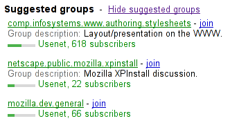
< h3 > Suggested groups</ h3 >
< menu >
< li >< a href = "?cmd=hsg" onclick = "hideSuggestedGroups()" > Hide suggested groups</ a ></ li >
</ menu >
< ul >
< li >
< p >< a href = "/group/comp.infosystems.www.authoring.stylesheets/view" > comp.infosystems.www.authoring.stylesheets</ a > -
< a href = "/group/comp.infosystems.www.authoring.stylesheets/subscribe" > join</ a ></ p >
< p > Group description: < strong > Layout/presentation on the WWW.</ strong ></ p >
< p > < meter value = "0.5" > Moderate activity,</ meter > Usenet, 618 subscribers</ p >
</ li >
< li >
< p >< a href = "/group/netscape.public.mozilla.xpinstall/view" > netscape.public.mozilla.xpinstall</ a > -
< a href = "/group/netscape.public.mozilla.xpinstall/subscribe" > join</ a ></ p >
< p > Group description: < strong > Mozilla XPInstall discussion.</ strong ></ p >
< p > < meter value = "0.25" > Low activity,</ meter > Usenet, 22 subscribers</ p >
</ li >
< li >
< p >< a href = "/group/mozilla.dev.general/view" > mozilla.dev.general</ a > -
< a href = "/group/mozilla.dev.general/subscribe" > join</ a ></ p >
< p > < meter value = "0.25" > Low activity,</ meter > Usenet, 66 subscribers</ p >
</ li >
</ ul > このようにレンダリングされるだろう:
ユーザーエージェントは、コンテキストヘルプまたは実際の値を記述するインラインテキストを提供するために、title属性と他の属性を結合する。
たとえば、次の断片で:
< meter min = 0 max = 60 value = 23.2 title = seconds ></ meter > 1行目に"Value: 23.2 out of 60."、2行目に"seconds"というツールチップを伴うケージをユーザーエージェントに表示させるかもしれない。
次の例は、ゲージがローカライズされたまたは整形済みテキストにフォールバックする様子を示す。
< p > Disk usage: < meter min = 0 value = 170261928 max = 233257824 > 170 261 928 bytes used
out of 233 257 824 bytes available</ meter ></ p > fieldset要素Support in all current engines.
legend要素、その後にフローコンテンツが続く。disabled — 内部のlegendを除いて、フォームコントロールが無効であるかどうかform — form要素とこの要素を関連付けるname — form.elements APIで使用する要素の名前HTMLFieldSetElementを使用する。fieldset要素は、選択肢でキャプションとともに、グループ化されたフォームコントロール(または他のコンテンツ)の集合を表す。キャプションは、fieldset要素の子である最初のlegend要素がもしあれば、それによって与えられる。子孫の残りの部分は、グループを形成する。
Element/fieldset#attr-disabled
Support in all current engines.
disabled属性は指定された場合、もしあれば、無効にするために、fieldset要素の所有する最初のlegend要素の子に属する子孫であるものを除き、fieldset要素の全フォームコントロールの子孫をもたらす。
次の条件のいずれかにマッチする場合にfieldset要素は無効フィールドである:
form属性は、フォームの所有者とfieldset要素を明示的に関連付けるために使用される。name属性は要素の名前を表す。
fieldset.type文字列"fieldset"を返す。
fieldset.elements要素内のフォームコントロールのHTMLCollectionを返す。
この例は、関連するコントロールの集合をグループ化するために使用されているfieldset要素を示す:
< fieldset >
< legend > Display</ legend >
< p >< label >< input type = radio name = c value = 0 checked > Black on White</ label >
< p >< label >< input type = radio name = c value = 1 > White on Black</ label >
< p >< label >< input type = checkbox name = g > Use grayscale</ label >
< p >< label > Enhance contrast < input type = range name = e list = contrast min = 0 max = 100 value = 0 step = 1 ></ label >
< datalist id = contrast >
< option label = Normal value = 0 >
< option label = Maximum value = 100 >
</ datalist >
</ fieldset > 次の断片は、fieldsetが有効であるかどうかを制御する、凡例内でチェックボックスを持つフィールドセットを示す。fieldset要素のコンテンツは、必須のテキストコントロールと任意の年/月コントロールで構成される。
< fieldset name = "clubfields" disabled >
< legend > < label >
< input type = checkbox name = club onchange = "form.clubfields.disabled = !checked" >
Use Club Card
</ label > </ legend >
< p >< label > Name on card: < input name = clubname required ></ label ></ p >
< p >< label > Card number: < input name = clubnum required pattern = "[-0-9]+" ></ label ></ p >
< p >< label > Expiry date: < input name = clubexp type = month ></ label ></ p >
</ fieldset > fieldset要素はまたネストできる。前のものの拡張例は次のとおり:
< fieldset name = "clubfields" disabled >
< legend > < label >
< input type = checkbox name = club onchange = "form.clubfields.disabled = !checked" >
Use Club Card
</ label > </ legend >
< p >< label > Name on card: < input name = clubname required ></ label ></ p >
< fieldset name = "numfields" >
< legend > < label >
< input type = radio checked name = clubtype onchange = "form.numfields.disabled = !checked" >
My card has numbers on it
</ label > </ legend >
< p >< label > Card number: < input name = clubnum required pattern = "[-0-9]+" ></ label ></ p >
</ fieldset >
< fieldset name = "letfields" disabled >
< legend > < label >
< input type = radio name = clubtype onchange = "form.letfields.disabled = !checked" >
My card has letters on it
</ label > </ legend >
< p >< label > Card code: < input name = clublet required pattern = "[A-Za-z]+" ></ label ></ p >
</ fieldset >
</ fieldset > この例において、外側の"Use Club Card"チェックボックスがチェックされない場合、2つのネストされたfieldsetのlegendで2つのラジオボタンを含む、外側のfieldset内部のすべては無効になる。しかし、チェックボックスがチェックされる場合、ラジオボタンが両方とも有効に設定され、有効にするよう2つの内部fieldsetのどちらが選択できるようになる。
この例は、legend要素がグループをラベル付けし、ネストされた見出し要素が文書のアウトラインでグループを表面化する、コントロールのグループ化を示している:
< fieldset >
< legend > < h2 >
How can we best reach you?
</ h2 > </ legend >
< p > < label >
< input type = radio checked name = contact_pref >
Phone
</ label > </ p >
< p > < label >
< input type = radio name = contact_pref >
テキスト
</ label > </ p >
< p > < label >
< input type = radio name = contact_pref >
Email
</ label > </ p >
</ fieldset > legend要素Support in all current engines.
fieldset要素の最初の子として。optgroup要素の最初の子として。optgroup要素の子である場合:フレーズコンテンツ。ただし、tabindex属性をもつインタラクティブコンテンツおよび子孫は存在してはならない。HTMLLegendElementを使用する。legend要素は、legend要素の親fieldset要素に属する残りのコンテンツのキャプションを表す。そうでなければ、legendが親optgroup要素を持つ場合、legendはg14>optgroupのラベルを表す。
legend.form存在するならば、要素のform要素を返し、またはそうでなければnullを返す。
selectedcontent要素select要素の子であるbutton要素の子孫として。HTMLSelectedContentElement.selectedcontent要素は、select要素の現在選択されているoption要素の内容を反映する。selectedcontent要素は、select要素の最初の子button要素内の選択されたoption要素のコンテンツを宣言的に表示するために使用できる。
option要素のlabel属性は、オプションのラベルを表示するために使用できるが、selectedcontent要素は label属性の内容を反映しない。
selectの選択されたoptionがあるオプションから別のオプションに切り替わるたびに、selectedcontent要素はそのすべての子を削除し、selectの選択されたoption要素のDOM構造の新しいコピーに置き換える。
すべてのselectedcontent要素は真偽値disabledを持ち、これは初期値はfalseである。
To update a select's selectedcontent given a select element select:
Let selectedcontent be the result of get a select's enabled selectedcontent given select.
If selectedcontent is null, then return.
Let option be the first option in select's list of options whose selectedness is true, if any such option exists, otherwise null.
If option is null, then run clear a selectedcontent given selectedcontent.
Otherwise, run clone an option into a selectedcontent given option and selectedcontent.
To get a select's enabled selectedcontent given a select element select:
If select has the multiple attribute, then return null.
Let selectedcontent be the first selectedcontent element descendant of select in tree order if any such element exists; otherwise return null.
If selectedcontent's disabled is true, then return null.
Return selectedcontent.
To clone an option into a selectedcontent, given an option element option and a selectedcontent element selectedcontent:
Let documentFragment be the result of creating a document fragment given option's node document.
For each child of option's children:
Replace all with documentFragment within selectedcontent.
To clear a selectedcontent given a selectedcontent element selectedcontent:
Replace all with null within selectedcontent.
To clear a select's non-primary selectedcontent elements, given a select element select:
Let passedFirstSelectedcontent be false.
For each descendant of select's descendants in tree order that is a selectedcontent element:
If passedFirstSelectedcontent is false, then set passedFirstSelectedcontent to true.
Otherwise, run clear a selectedcontent given descendant.
The selectedcontent HTML element post-connection steps, given selectedcontent, are:
Let nearestSelectAncestor be null.
Set selectedcontent's disabled to false.
For each ancestor of selectedcontent's ancestors, in reverse tree order:
If selectedcontent's disabled is true, nearestSelectAncestor is null, or nearestSelectAncestor has the multiple attribute, then return.
Run update a select's selectedcontent given nearestSelectAncestor.
Run clear a select's non-primary selectedcontent elements given nearestSelectAncestor.
The selectedcontent HTML element removing steps, given removedNode, isSubtreeRoot, and oldAncestor are:
If removedNode's disabled is true, then return.
For each ancestor of removedNode's ancestors, in reverse tree order:
If ancestor is a select element, then return.
For each ancestor of oldAncestor's inclusive ancestors, in reverse tree order:
If ancestor is a select element, then run update a select's selectedcontent given ancestor and return.